drawing, ink
#
drawing
#
aged paper
#
toned paper
#
light pencil work
#
dutch-golden-age
#
pencil sketch
#
sketch book
#
landscape
#
personal sketchbook
#
ink
#
pen-ink sketch
#
pen work
#
sketchbook drawing
#
genre-painting
#
sketchbook art
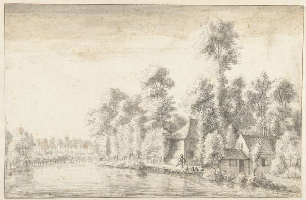
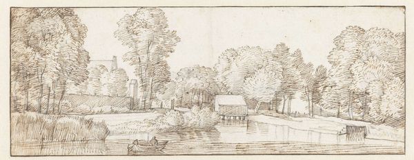
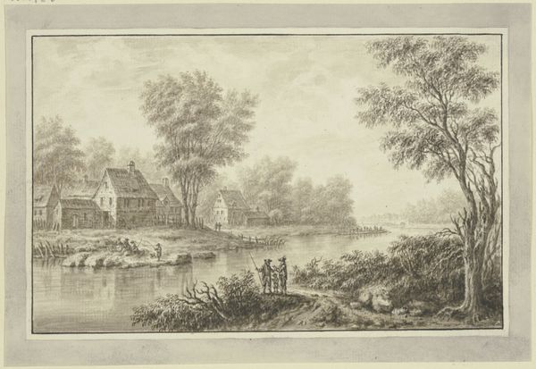
Dimensions: height 90 mm, width 150 mm
Copyright: Rijks Museum: Open Domain
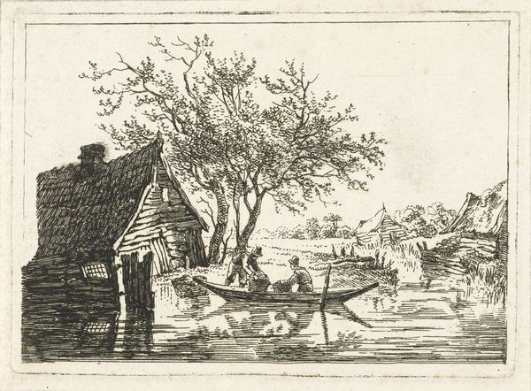
Editor: Here we have "Landscape with two houses by a Water" by Jan Jansz. den Uyl II, dating anywhere from 1634 to 1702. It’s a pen and ink drawing. What strikes me is the contrast between the delicate linework and the subject itself: the everyday life near a waterway. What can you tell me about how we should visually approach this artwork? Curator: Note how the composition leads the eye from the bottom right, with the figure poling a boat, across the water, and then rests on the clustered houses in the background, framed by the trees. The artist employs a rather limited tonal range; primarily line. Consider the texture created by the hatching and cross-hatching techniques used to define forms and shadows, especially in the trees and foliage. What effect do you think this careful detail has? Editor: I see what you mean, it makes the scene almost tangible, even though it's just a sketch. Is the aged paper intentionally "toned", or did that just occur over time? Curator: Indeed! The use of toned paper complements the ink. Note the effect it has on the lighter areas of the drawing; how it softens the starkness, and contributes to the work's atmospheric perspective. And regarding your astute question about the paper's toning, regardless of its intention, how does it play into our interpretation of the drawing as a whole? Editor: Good point! That gives me a lot to consider about the deliberate nature of this piece. I was too quick to jump to "snapshot" at first! Thanks! Curator: It’s in precisely such a process of disciplined viewing and careful consideration of detail that we may gain richer insight. A beautiful little piece!
Comments
No comments
Be the first to comment and join the conversation on the ultimate creative platform.
More like this