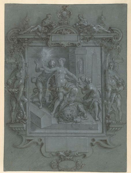
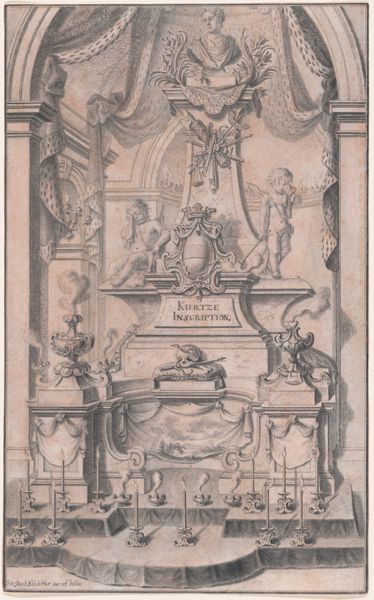
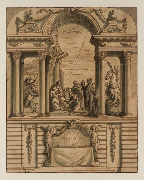
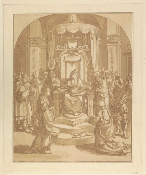
The Presentation in the Temple, with a Design for a Sculpted Frame c. 1630 - 1635
0:00
0:00
painting, watercolor
#
portrait
#
baroque
#
painting
#
figuration
#
oil painting
#
watercolor
#
history-painting
#
watercolor
Copyright: Public Domain: Artvee
Curator: Let's turn our attention to "The Presentation in the Temple, with a Design for a Sculpted Frame" by Jacob Jordaens, created around 1630 to 1635. It's a fascinating piece that combines both painting and the design for a sculpted frame. Editor: My immediate reaction is how it collapses the sacred and profane—that bustling scene with the very ornamented architectural surround feels almost theatrical, a designed experience. Curator: Exactly. Consider the materials used—watercolor and oil on paper. The blend allows Jordaens to explore the textures of both the painted scene and the sculpted frame design, raising questions about the intended production. Was he aiming for a patron or exploring a combined workshop production between painters and sculptors? Editor: The dynamism created by the frame certainly guides the viewer's eye. The cherubs at the top draw your focus upward, framing the holy family below, while the stark symmetry adds to the solemnity. But then there’s the rather unusual skull motif... Curator: Those skulls certainly add layers. Are they memento mori, intended as private contemplations within the patron’s domestic space, acting as prompts to consider mortality within this sacred narrative? The piece invites speculation about how and for whom such devotional objects were commissioned and used. Editor: Visually, the figures create a striking pyramidal composition that centralizes Jesus. And observe the use of color—the red curtain backdrop really enhances the drama of the moment, no? A clear Baroque strategy for heightening emotional intensity. Curator: Agreed. Further study into pigment sources during the 17th century would no doubt enrich the production narrative too—where were the colours sourced, what was their cost? These things shape the availability of such artworks. Editor: The interplay between line and shadow is also so key, look how Jordaens uses dark washes to create depth and emphasize the three-dimensionality within both the painted figures and the suggested sculptural reliefs. Curator: What is fascinating here is the blurred distinction between fine art and decorative design; questioning such divisions provides rich opportunities to discuss Jordaens’ labour within a commercial workshop setting. Editor: I see this Baroque dynamism rendered in this intimate study that allows one to trace an artist mind through color and form in the service of an overall impactful image. Curator: Yes, by exploring the materials and production processes, as well as the combined disciplines displayed in “The Presentation”, it gives insights to how social forces shaped artistic practices and audiences.
Comments
No comments
Be the first to comment and join the conversation on the ultimate creative platform.
More like this