Copyright: Rijks Museum: Open Domain
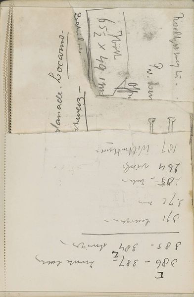
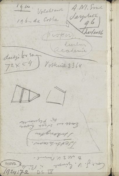
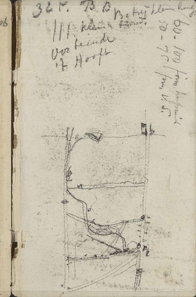
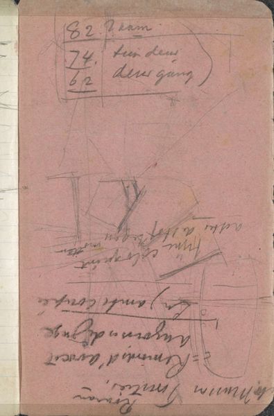
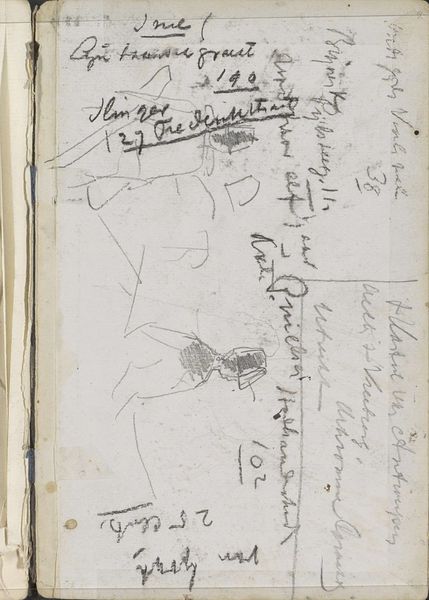
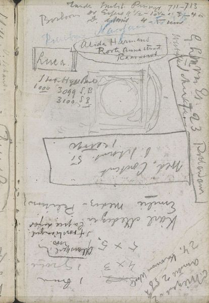
Editor: Here we have George Hendrik Breitner's "Compositiestudie" from 1910, a pencil drawing on paper currently held at the Rijksmuseum. What strikes me is how casually it combines sketching with, it seems, some kind of found typography. What do you see in this piece? Curator: What captivates me is the dialogue between the quick impressions – those rapid pencil sketches of figures – and the embedded, almost archaeological fragment of the printed paper. Look how the sketch bleeds into the commercial typography, almost a palimpsest of urban experience. Editor: Palimpsest? Curator: Yes, like an old parchment scraped clean and rewritten, but with traces of the original still visible. The advertisement’s ornate typeface and the sketches’ immediacy both speak to a rapidly changing Amsterdam, caught between tradition and modernity. Do you think that relationship is intentional? Editor: Perhaps. The way Breitner layers the marks and printed text does evoke a sense of the city’s crowded visual landscape. Is that connection something others have noticed about his work? Curator: Definitely. His Impressionist paintings captured similar juxtapositions – the fleeting moment and the solid, enduring city. Here, on paper, it is as if the act of sketching is itself an act of remembering, salvaging fragments from the ephemeral flow of urban life. It almost gives you a feel for the mental life of someone experiencing the city around them. Editor: It’s like he’s capturing the way our brains organize information - visual impressions combined with random text. I never considered that. Thanks for pointing that out! Curator: And thank you, it's insightful questions like yours that reveal these layers of meaning. The city is always writing and rewriting itself, just as we do.
Comments
No comments
Be the first to comment and join the conversation on the ultimate creative platform.
More like this