drawing
#
drawing
#
art-nouveau
#
geometric
#
line
Dimensions: 78 x 63 cm
Copyright: Public domain
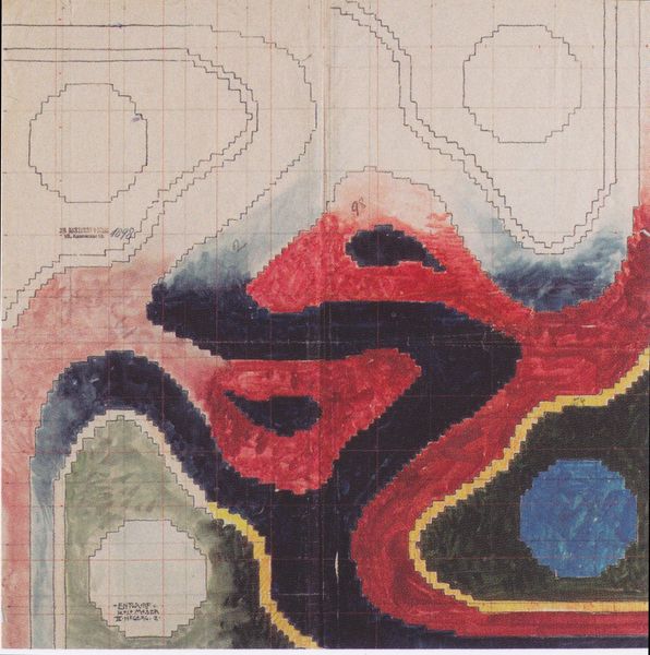
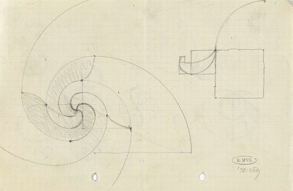
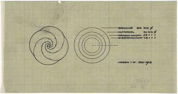
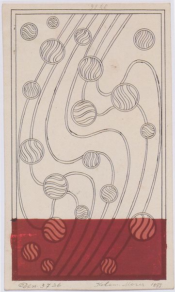
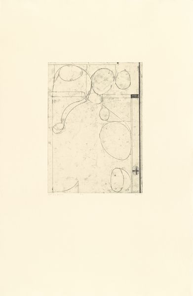
Editor: Here we have "Fabric design with moving waves for Backhausen" created in 1902 by Koloman Moser. The flowing lines suggest, well, waves! The whole composition has a kind of dreamlike quality. What catches your eye, looking at this drawing? Curator: Well, it is fascinating to see this design in light of the Wiener Werkstätte's ambitions. This movement aimed to create a total work of art that integrated life and art, influencing everything from architecture to everyday objects. So, fabric design wasn't merely decorative; it was part of a broader project for social transformation, envisioning a harmonious environment that shaped people's lives. Do you see any reflection of that in Moser’s choices? Editor: That's interesting. So, beyond just pretty patterns, this design for fabric reflects a desire to impact how people live, even their sense of well-being. Perhaps the repetitive, almost hypnotic wave patterns were meant to induce a feeling of calm or tranquility in the domestic sphere? It reminds me a bit of wallpaper design. Curator: Precisely. And consider how the design incorporates these almost fish-like shapes. It is a deliberate blurring of the natural and the abstract, in a manner to which, in that moment in time, only the elite could afford. Think of it within the Arts and Crafts movement, aiming to counter industrialization by reviving craft traditions. This piece can also be interpreted as a critique of industrial society, or perhaps a reflection of fin-de-siècle anxieties? Editor: It seems the visual impact is connected to broader artistic and societal trends that promoted aesthetic principles within functional spaces. What else can you tell us about the imagery and the organization that gave rise to the textile? Curator: Notice how the rhythmic patterns can make a space inviting or overstimulating? How does the choice of color influence this experience, particularly regarding perceptions of harmony and tranquility within domestic or public settings? It invites you to consider its meaning within the shifting landscapes of art. Editor: That’s a lot to unpack; this drawing tells us much about social reform and the business strategies of decorative imagery. Thank you!
Comments
No comments
Be the first to comment and join the conversation on the ultimate creative platform.
