drawing, print, engraving
#
portrait
#
drawing
#
medieval
# print
#
pencil sketch
#
old engraving style
#
figuration
#
engraving
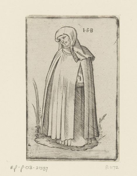
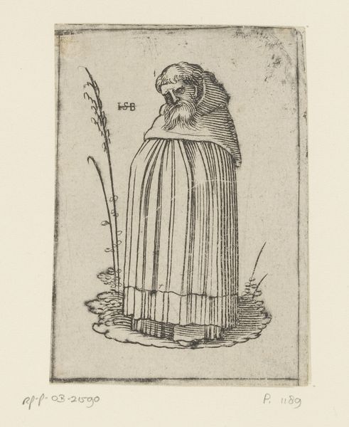
Dimensions: height 99 mm, width 68 mm
Copyright: Rijks Museum: Open Domain
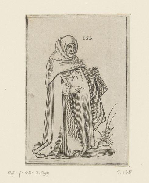
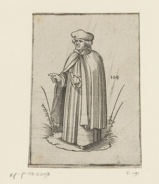
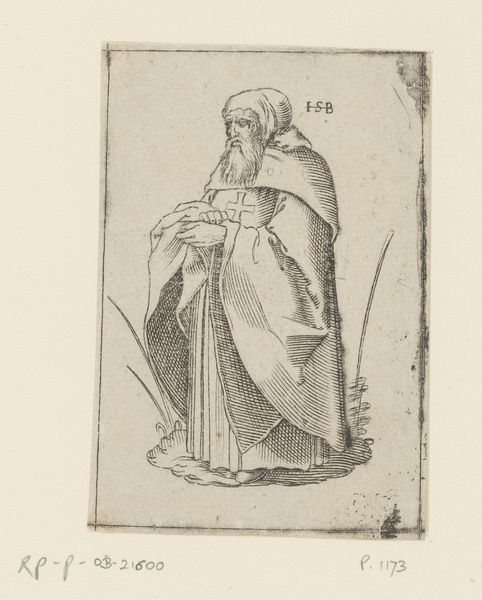
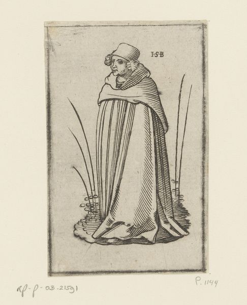
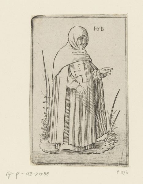
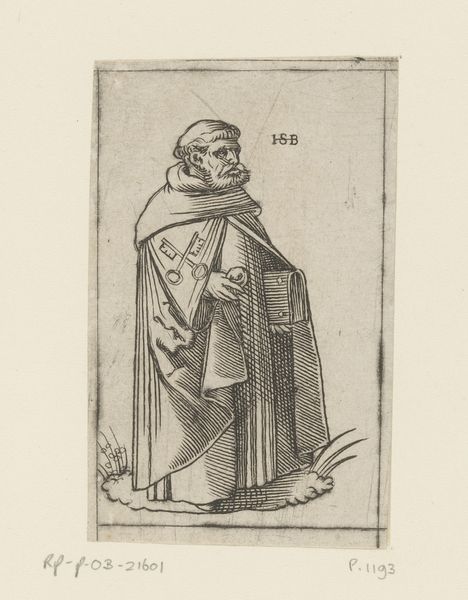
Editor: Here we have an engraving titled "Monnik van de orde der Lazaristen," or "Monk of the Lazarist Order," made after 1526. It’s currently at the Rijksmuseum. It looks so austere. How should we read a piece like this? Curator: One must focus on the inherent properties of the artwork. Observe the use of line, specifically the density and direction. The varying thicknesses define the figure, create volume, and suggest light and shadow without reliance on colour. Note also the hatching and cross-hatching, which creates tonal variations within the monochromatic scheme. Editor: So, it's all about how the artist created the image itself, not so much the subject matter? Curator: Precisely. Consider the economy of line in rendering the monk's habit. There is a deliberate simplicity that speaks to the core aesthetic of the work. Notice, too, how the ground plane is established through the subtle variations in line weight and direction. Do you perceive how this ground gives the figure form? Editor: I see what you mean. It almost anchors him. So the use of line not only creates the figure, but also creates depth and defines the space he occupies. Curator: Precisely. The inscription "I S B" in the upper-right begs interpretation through semiotics; however, that line of reasoning departs from formalist principles, and falls prey to conjecture. The strength of the piece inheres in its structure. Editor: That’s a different way of looking at it. Focusing on the lines themselves as a language of art helps me understand its composition and impact more clearly. Curator: It allows us a pure engagement with the artwork, detached from subjective interpretations, instead grounding appreciation in objective elements of design.
Comments
No comments
Be the first to comment and join the conversation on the ultimate creative platform.
More like this