acrylic-paint
#
minimalism
#
colour-field-painting
#
acrylic-paint
#
geometric
#
abstraction
#
hard-edge-painting
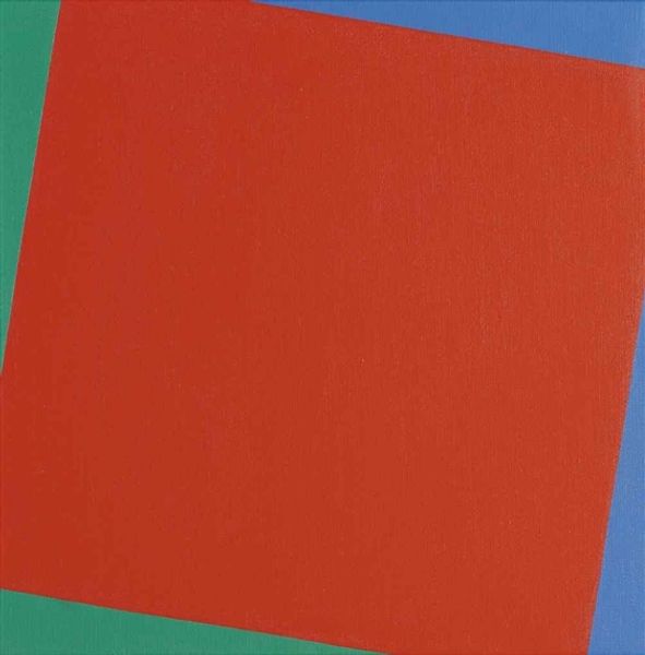
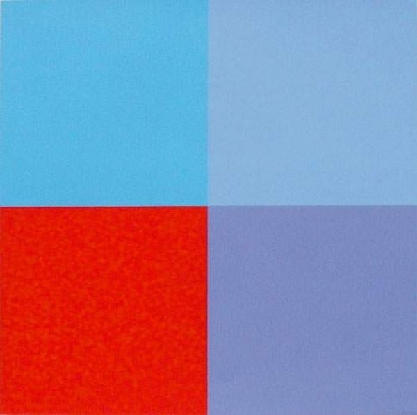
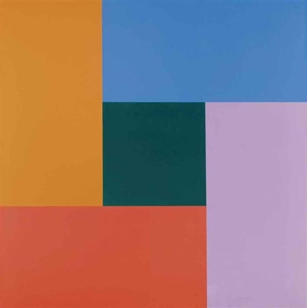
Copyright: Richard Paul Lohse,Fair Use
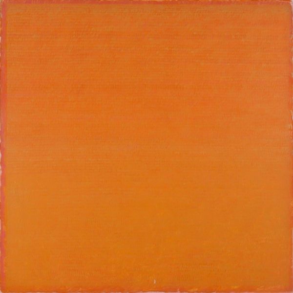
Curator: Here, we have Richard Paul Lohse's "Accent on Orange," an acrylic painting from 1968. Its hard-edged forms immediately catch the eye. What are your first thoughts? Editor: It's arresting. The colors—that brilliant orange against the cooler blue tones—it has a striking simplicity, almost like a swatch. I’m curious about the tactile nature of it, the paint itself. Curator: The interplay is fundamental. The narrow band of light blue creates a transition, activating a spatial dialogue between the larger blocks of color. Editor: Right, but that “spatial dialogue” occurs because someone made it happen. I'm interested in Lohse's physical choices: the type of acrylic, the canvas, and the number of layers of pigment that achieve this striking surface. Did he apply these colors industrially or with his hand? These choices and actions emphasize a specific connection to labor. Curator: That’s an interesting lens. From a purely formal perspective, though, this controlled arrangement transcends the mundane. Lohse employs minimalist techniques to strip away extraneous details. What remains is an exploration of pure, unadulterated form and color relationships. It is a structural composition, if you will. Editor: Agreed, he achieves something structurally impactful through simplicity. But I find myself thinking about the accessibility of these materials during that time. Who could afford quality acrylics? Were these materials connected to certain economic realities? This connects back to the labor that facilitates the creation of such art. Curator: Perhaps, but let's also consider Lohse's theoretical foundations. He drew heavily from Concrete Art principles, advocating for objectivity and the systematization of artistic elements. The artwork's essence isn’t derived from external references. The only reference here is itself and the elements he composed. Editor: I think that that kind of structural precision itself requires work. Perhaps the concrete aims mask how Lohse still dealt with practicalities of producing something with specific materials. But I admit the effect is still clean. Curator: Precisely. This tension encapsulates the piece, inviting dialogue through abstraction. Editor: And forcing a fresh look into what constitutes minimalism, and even labor, itself. Curator: A valuable reflection indeed.
Comments
No comments
Be the first to comment and join the conversation on the ultimate creative platform.
More like this