Dimensions: height 281 mm, width 221 mm
Copyright: Rijks Museum: Open Domain
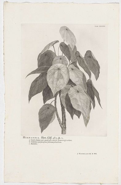
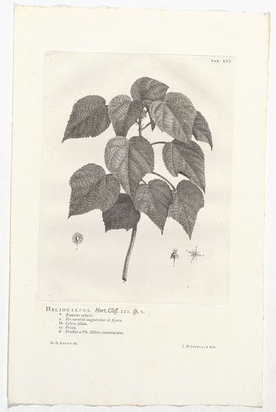
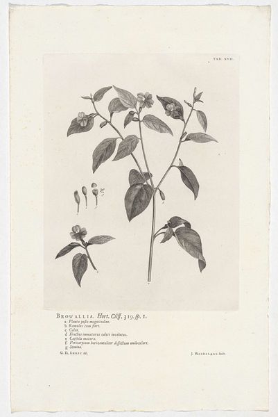
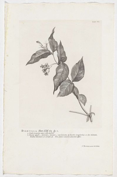
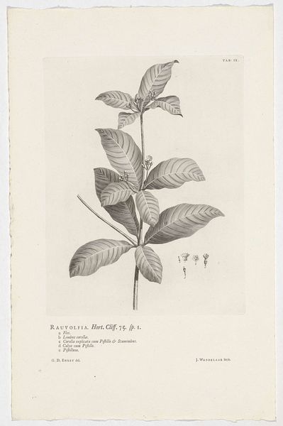
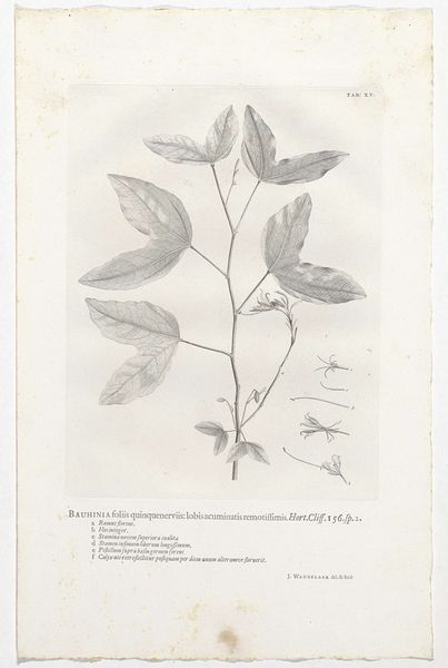
Editor: This is Jan Wandelaar's "Hura crepitans," an engraving made in 1738. It strikes me as an exercise in contrasts. The stark black ink against the off-white paper makes for such dramatic botanical details, especially the rendering of light and shadow on the leaves. What stands out to you when you look at this print? Curator: Notice the almost mathematical precision in the arrangement of forms. The composition is governed by a distinct linearity – the way each leaf is delineated with clear, unwavering lines, for example. But this linearity is then offset by the organic shapes it represents. Observe also the plate marks and paper quality— these give clues to the printing and its affectations. How do you think this tension contributes to the overall impact of the work? Editor: It’s almost as if the rigid, scientific approach emphasizes the wildness of nature even more. Like capturing something untamable. Is that sense of opposition something common in botanical illustrations from this period? Curator: The use of line and form to create texture is rather significant. The layering of engraved lines gives depth and volume to the leaves, simulating their tactile presence. In examining these specific visual elements, can you speculate how the artist has used a restricted range to represent an unbounded object of interest? Editor: So, focusing on line and texture, the artist creates an ordered but believable interpretation of the plant, that also serves its academic purpose. Thanks, it’s really made me think about how much an artist’s choices can impact something seemingly straightforward like a botanical illustration. Curator: Indeed. A concentrated focus on the intrinsic elements exposes complex meaning!
Comments
No comments
Be the first to comment and join the conversation on the ultimate creative platform.
More like this