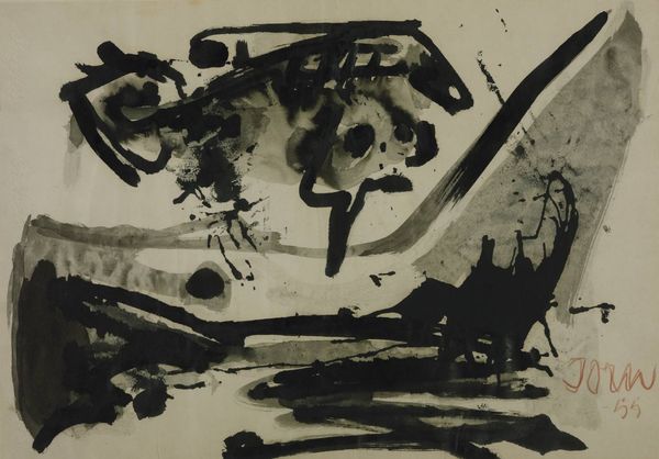
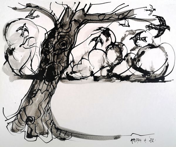
drawing, ink
#
drawing
#
minimalism
#
stencil
#
ink
#
geometric
#
abstraction
#
line
#
monochrome
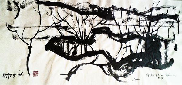
Dimensions: 50 x 60 cm
Copyright: Creative Commons NonCommercial
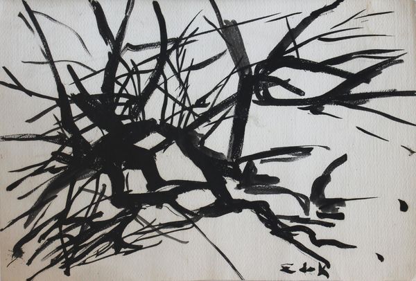
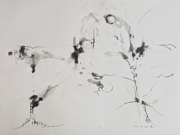
Curator: Today, we're looking at Alfred Freddy Krupa's "Minimalism," an ink drawing from 1994. It strikes me immediately as…well, skeletal, almost like winter's blueprint, or the hidden architecture of nature laid bare. Editor: It does feel rather barren, but not in a bleak way. There's a serenity, perhaps even a celebration of pure form. The high contrast of ink on paper certainly accentuates that stark quality, as do the decisive, energetic brushstrokes, Curator: Exactly! There’s this incredible energy in those strokes— a raw, almost calligraphic intensity which makes sense, as Krupa was inspired by Asian traditions of ink wash painting. Did he seek to refine observation into near gestural essence? I wonder. Editor: It does share qualities with sumi-e, absolutely. The composition is cleverly balanced, you know? The stark verticals of the tree trunk anchors the eye, against the horizontal branches implying the picture plane itself. The overall asymmetrical nature actually generates visual intrigue. Curator: True, and speaking of intrigue—do you see what appear to be abstracted structures emerging between the branches? Almost as if Krupa is blurring the boundary between the natural world and human construction. What do you make of those more geometric marks within the network of lines? They lend a mysterious edge to what might otherwise be a purely tranquil scene. Editor: Interesting! They add layers, yes, providing depth that complicates this initial simplistic appearance. Are they buildings? Streetlights? I appreciate how these shapes make you pause, questioning the seemingly obvious and the artist’s intention. Curator: Right. "Intention"— such a slippery concept. Maybe it's about distilling form itself into the building blocks of both the natural and built environments. It gives one pause. What is truly fundamental in visual language, the bare minimum required to convey something larger? Editor: The use of monochrome is also so central; not just ink but the *idea* of a single hue and its tonal variation—reducing a complex scene down to essentials, highlighting relationships of light, shade, void and form... it really embodies the principle of minimalism! Curator: It all converges into such a concise statement about the interplay between abstraction and recognition. We find ourselves reconstructing a scene, engaging actively with these elemental shapes, not just passively observing. It encourages you to interpret as much as behold; it gives us so little but inspires in turn so much. Editor: A piece that holds onto you. Each stark stroke prompts questions regarding depth, perspective, or significance, transforming that sense of starkness into this opportunity for imaginative construction and aesthetic enjoyment!
Comments
No comments
Be the first to comment and join the conversation on the ultimate creative platform.
More like this