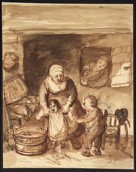
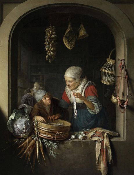
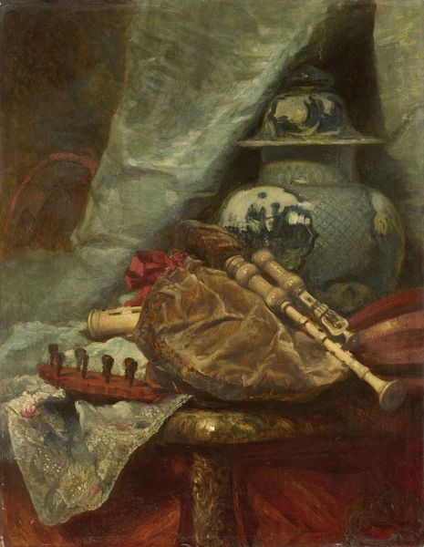
painting, gouache, acrylic-paint
#
gouache
#
narrative-art
#
painting
#
gouache
#
fantasy-art
#
acrylic-paint
#
figuration
#
coloured pencil
#
watercolour illustration
#
watercolor
Copyright: Modern Artists: Artvee
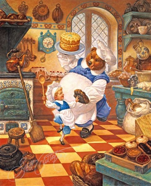
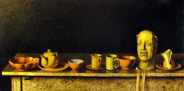
Editor: Here we have *Country Mouse and City Mouse* by Scott Gustafson, likely rendered in gouache or perhaps acrylics. There’s something so wonderfully detailed and warm about this tableau, but also, the forced perspective makes it a tad unsettling. What compositional elements stand out to you? Curator: Initially, the interplay between texture and scale captivates the eye. Consider the rendering of the various surfaces: the polished silver of the teapot, juxtaposed against the rough weave of the country mouse's clothing, each crafted with precision. And, as you’ve noted, the shifts in perspective and scale aren’t accidental. Note how the artist toys with our perception by presenting the mice on a scale incongruent with their surroundings. Editor: So, the deliberate manipulation of scale contributes to the overall meaning? Is there any semiotic aspect? Curator: Precisely. Scale functions here as a signifier. Observe the size of the food relative to the mice; it overwhelms them. One might argue it represents the abundance and perhaps excess of the city life versus the perceived simplicity of country life, as the fable goes. However, it's vital to analyze the structure of this image irrespective of inherent social messages. Editor: Interesting. Now that I think about it, even the palette emphasizes the dichotomy. The city mouse occupies the area dominated by cooler, more artificial colours and gleaming surfaces, while his counterpart is in an earthy setting. Curator: Yes, and the arrangement, divided between warm browns and golds and cooler blues and greys, creates a clear visual separation that reinforces the narrative’s binary structure. But notice too how the artist uses these contrasting elements to create balance across the composition, binding them together visually. Editor: I see that now. Initially, the imbalance was what struck me the most, but the composition, as a whole, finds equilibrium through colour and texture, making it more about dialogue than division. Curator: Precisely. It urges us to see past simple binaries, finding the artistry in the structure itself.
Comments
No comments
Be the first to comment and join the conversation on the ultimate creative platform.
More like this