About this artwork
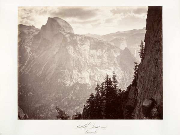
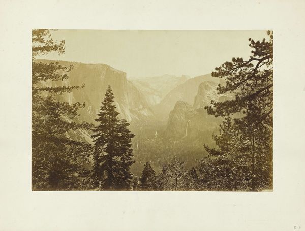
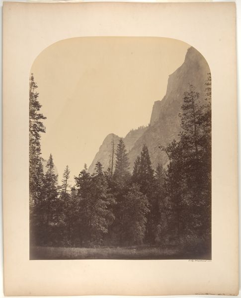
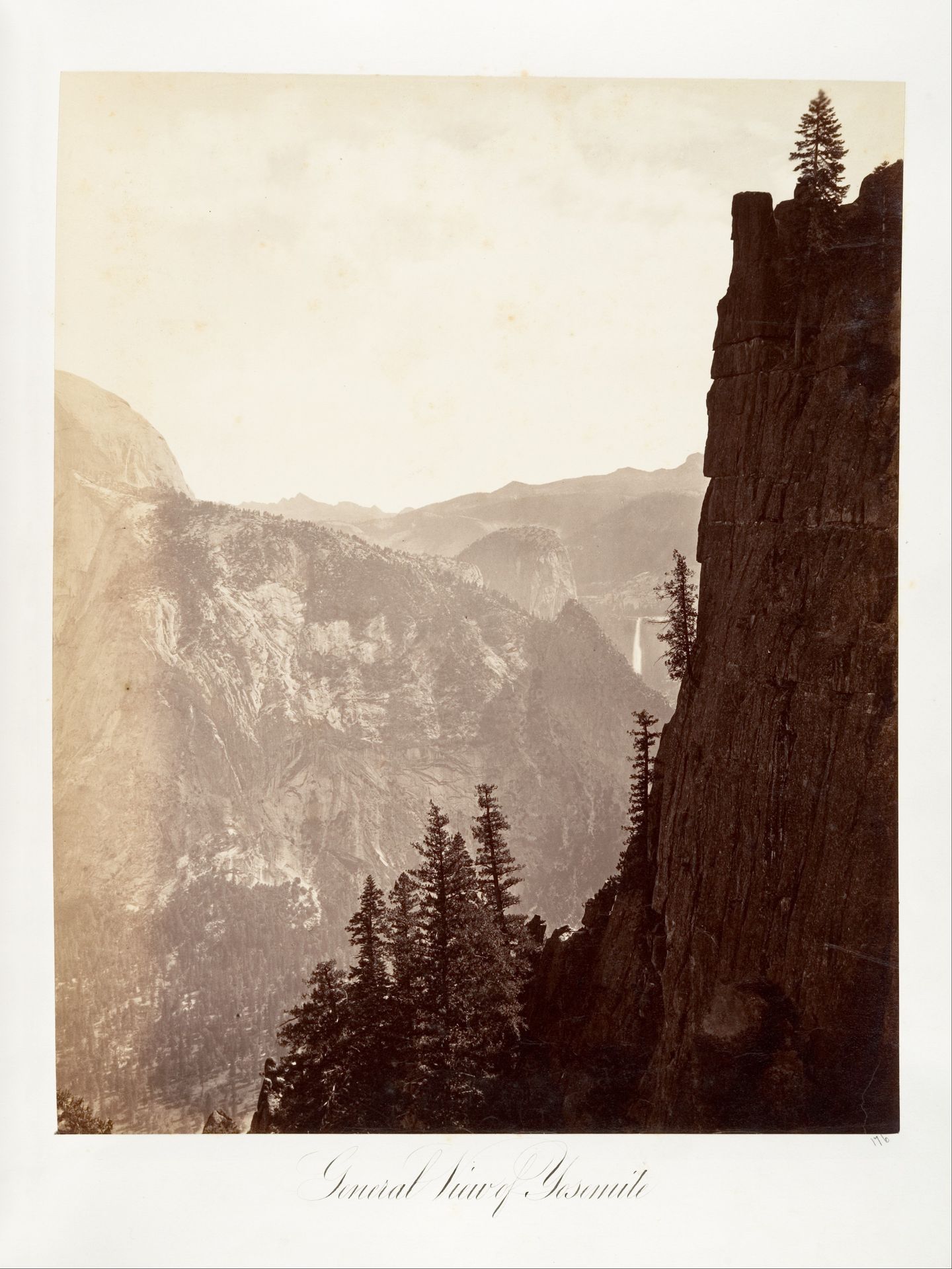
Editor: This gelatin-silver print, titled "General View of Yosemite," was created between 1870 and 1874 by Carleton Watkins. The texture of the stone feels so tangible, yet the overall tonal range gives it a dreamlike quality. What are some of the visual cues you see that stand out? Curator: The composition is masterful in its deployment of light and shadow. The stark contrast between the illuminated cliff face on the right and the more diffused background establishes a visual hierarchy. Note how Watkins guides the eye not through narrative content but through tonal relationships and the sheer materiality rendered in gelatin silver. What does the play of light and dark communicate to you? Editor: I guess the texture and shading definitely add to the drama, maybe even making it feel… sublime? But I hadn’t thought about how purposeful the use of light must have been. Curator: Precisely. The placement of that waterfall and wispy clouds in the distance adds a soft element to an otherwise austere vista. By modulating these components, Watkins creates a complex interplay. Notice how this is an essay in tonal graduation, and also, repetition; see if you can chart out all the repeating verticals! Editor: That makes me appreciate the organization more. Focusing on the relationship between visual elements adds to the understanding. Thanks! Curator: Indeed. By attending to the formal properties, we’ve unpacked another dimension of experience contained within.
General View of Yosemite
1870 - 1874
Carleton E. Watkins
1829 - 1916The Metropolitan Museum of Art
Metropolitan Museum of Art, New York, NYArtwork details
- Medium
- photography, gelatin-silver-print
- Location
- Metropolitan Museum of Art, New York, NY
- Copyright
- Public Domain
Tags
Comments
Share your thoughts
About this artwork
Editor: This gelatin-silver print, titled "General View of Yosemite," was created between 1870 and 1874 by Carleton Watkins. The texture of the stone feels so tangible, yet the overall tonal range gives it a dreamlike quality. What are some of the visual cues you see that stand out? Curator: The composition is masterful in its deployment of light and shadow. The stark contrast between the illuminated cliff face on the right and the more diffused background establishes a visual hierarchy. Note how Watkins guides the eye not through narrative content but through tonal relationships and the sheer materiality rendered in gelatin silver. What does the play of light and dark communicate to you? Editor: I guess the texture and shading definitely add to the drama, maybe even making it feel… sublime? But I hadn’t thought about how purposeful the use of light must have been. Curator: Precisely. The placement of that waterfall and wispy clouds in the distance adds a soft element to an otherwise austere vista. By modulating these components, Watkins creates a complex interplay. Notice how this is an essay in tonal graduation, and also, repetition; see if you can chart out all the repeating verticals! Editor: That makes me appreciate the organization more. Focusing on the relationship between visual elements adds to the understanding. Thanks! Curator: Indeed. By attending to the formal properties, we’ve unpacked another dimension of experience contained within.
Comments
Share your thoughts