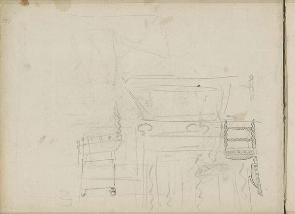
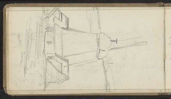
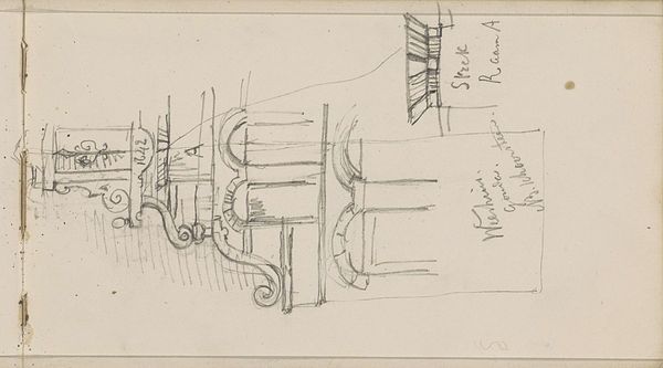
drawing, paper, pencil, architecture
drawing
script typography
hand-lettering
playful lettering
hand drawn type
hand lettering
paper
personal sketchbook
hand-drawn typeface
pencil
sketchbook drawing
academic-art
sketchbook art
architecture
small lettering
Copyright: Rijks Museum: Open Domain
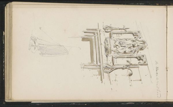
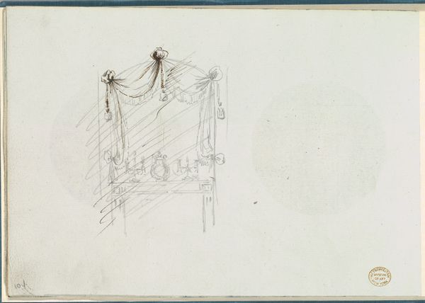
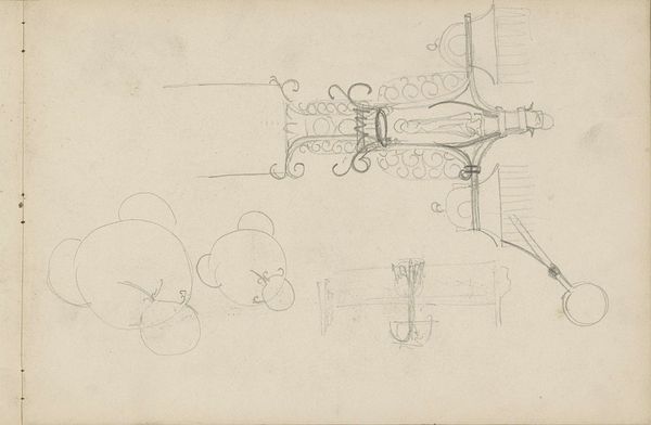
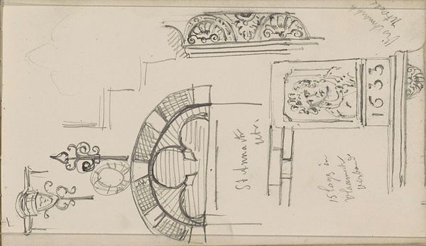
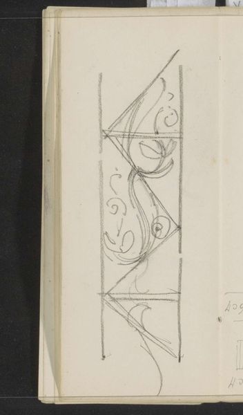
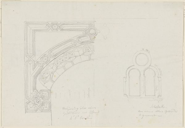
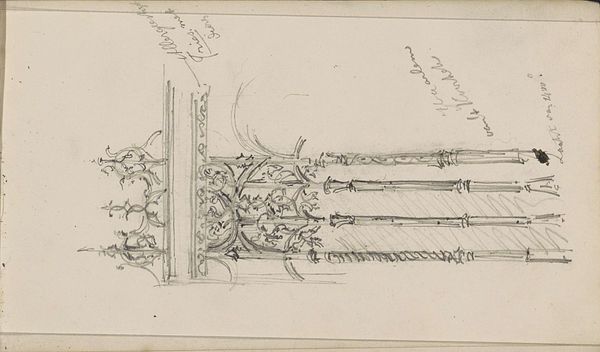
This architectural sketch, with 'Architectonisch detail met rolwerk', was made by Johanna van de Kamer. It shows her way of seeing and thinking about the world, through the simple act of mark making, as a process. Look at how she used a pencil on paper, capturing fleeting observations of architectural forms. You can almost feel the softness of the graphite, how the marks are smudged and layered, suggesting movement and change. It's a very delicate drawing. I am drawn to the swirling lines and open curves. They remind me of looping lines in a Cy Twombly drawing, both are equally committed to a process of exploration and discovery. The marks show Van de Kamer playing with perspective, proportion, and negative space. Ultimately, it is the unfinished quality of the sketch, the sense that it is a work in progress, which makes it so compelling. It makes us think about art as an ongoing conversation.
Comments
No comments
Be the first to comment and join the conversation on the ultimate creative platform.