#
aged paper
#
toned paper
#
water colours
#
light earthy tone
#
handmade artwork painting
#
coloured pencil
#
watercolour bleed
#
watercolour illustration
#
watercolor
#
warm toned green
Dimensions: height 69 mm, width 49 mm
Copyright: Rijks Museum: Open Domain
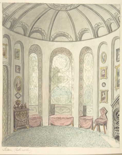
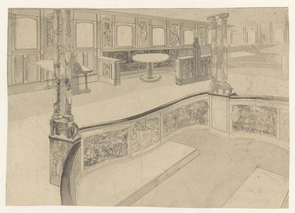
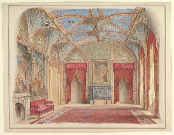
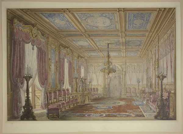
Curator: This watercolour by Jacob Ernst Marcus, from 1817, held here at the Rijksmuseum, depicts a grand salon. The walls are adorned with paintings, set off with ornate molding, all rendered in delicate colours. What catches your eye initially? Editor: It has an undeniably saccharine quality. The light pastels, the gilt details—it evokes an almost claustrophobic sense of aristocratic excess. It feels frozen in a pre-revolutionary dream, doesn't it? Curator: Interesting. For me, the repeated motifs are what resonate most. The small paintings inset into the wall, along with the dome above and repeated wall panel imagery, present classical themes framed within this opulent interior. The architecture itself seems to function as a frame for these curated images, a very intentional presentation of status and taste. Editor: Absolutely, but let’s not forget what’s implied through that presentation. The overt display, this performance of wealth, carries political weight. It reminds us who holds power, who controls the narrative, literally framing their version of history and beauty for generations to come. It speaks to the exclusion and inequality of the period. Curator: A fair point, it isn’t all sweetness and light, and the room might signal how art was used to convey not only beauty, but political power, for the elites of that era. But I can’t help noticing the care and artistry taken with the perspective. Notice how the vanishing point is just outside the window. It could point us to how the aristocracy saw itself—within a well defined, perfectly calibrated social order. Editor: I see that—but those artistic elements still reinforce existing structures of power, right? By showcasing the beauty and order available to the elite, the watercolor subtly affirms a hierarchy. Consider also the muted palette; is it an attempt to sanitise the potentially vulgar reality of such wealth? Curator: That's certainly one reading. Or could it be that the toned colours, the use of watercolours rather than oils, signifies a delicate, perhaps threatened beauty? What seems immutable could actually be fragile. Editor: I find myself returning to the space implied, where such 'fragile' beauty is maintained. Art provides clues of its use in maintaining societal order through both beauty and status. Curator: Yes, an image layered with meanings that invite deeper consideration. Editor: A dialogue we should continue.
Comments
No comments
Be the first to comment and join the conversation on the ultimate creative platform.
More like this