Copyright: CC0 1.0
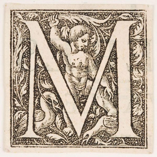
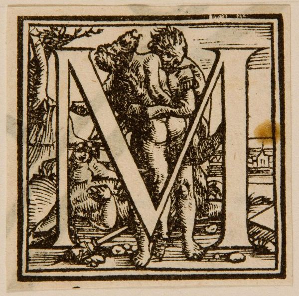
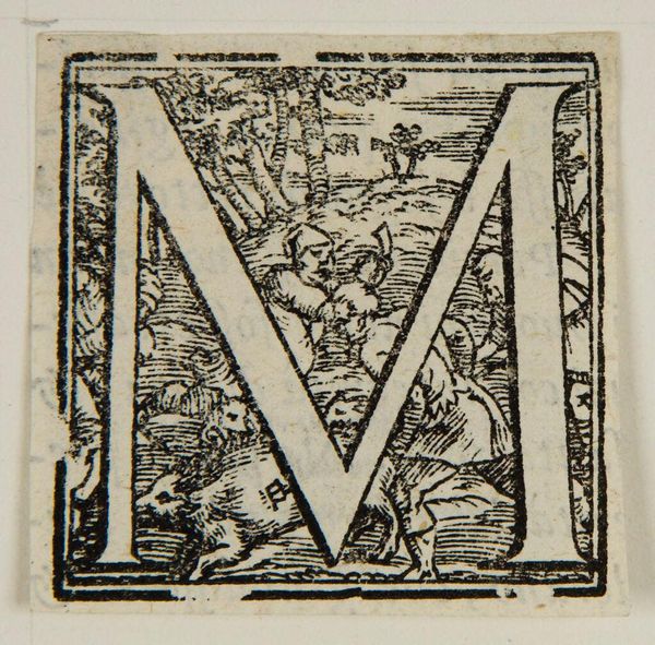
Editor: This is “Letter M,” by an anonymous artist. I’m struck by the stark contrast of the black ink against the paper. What do you see in the composition? Curator: Note how the artist has intricately interwoven figuration and foliage within the rigid structure of the letterform. The bold lines create a distinct visual hierarchy. How does the symmetry affect your reading of the piece? Editor: I see how the symmetry adds balance, while the asymmetry of the internal details adds visual interest. Thank you for pointing that out. Curator: Indeed, the work employs contrast to create harmony. A fascinating study of form and function!
Comments
No comments
Be the first to comment and join the conversation on the ultimate creative platform.
More like this