Copyright: Modern Artists: Artvee
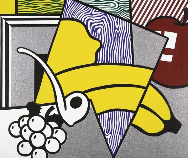
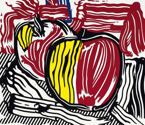
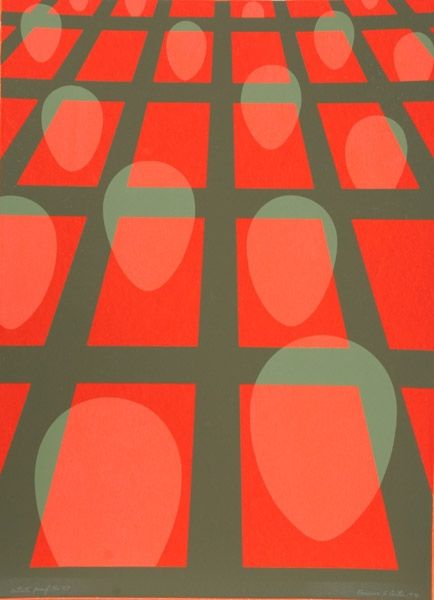
Editor: So, here we have Roy Lichtenstein's "Apples, Grapes, Grapefruit" from 1974. It's a painting, and the immediate impact is the bold graphic quality. The simplified forms and vibrant colors feel very… intentional. How do you interpret the formal qualities of this piece? Curator: The formal elements present a fascinating tension. Note the strategic deployment of stripes, which establishes a clear structural rhythm throughout the composition. However, observe how this rhythmic structure contrasts against the representational flatness of the fruit. Editor: Right, it’s a still life, but so deconstructed. I mean, those Ben-Day dots aren't even here. Instead of that, these graphic stripes create movement that challenges the traditional stillness. Curator: Precisely. How do the colors, specifically the contrast between the flat yellow, white and red against the blue lines contribute to the overall visual dynamic? Editor: The high contrast definitely amps up the pop-art sensibility. It's so direct and bold that it feels almost… artificial. Not quite what you’d find with other examples of art depicting “still life.” Curator: Consider how the rigid outlines further delineate each element. Each plane operates somewhat independently while still participating in a cohesive spatial construct. It invites a careful study of relationships within the frame. Do you see how the surface, colour and space combine in pictorial terms? Editor: I think it really comes down to his signature flattening technique – a conscious break away from naturalistic conventions and that his Pop influence allows us to consider how his visual vocabulary can change our interpretation of these very common subject matters. Curator: Indeed. It provokes a sustained reflection on what constitutes both representation and abstraction.
Comments
No comments
Be the first to comment and join the conversation on the ultimate creative platform.
More like this