#
toned paper
#
light pencil work
#
ink painting
# print
#
pencil sketch
#
charcoal drawing
#
charcoal art
#
pen-ink sketch
#
watercolour illustration
#
pencil art
#
watercolor
Copyright: National Gallery of Art: CC0 1.0
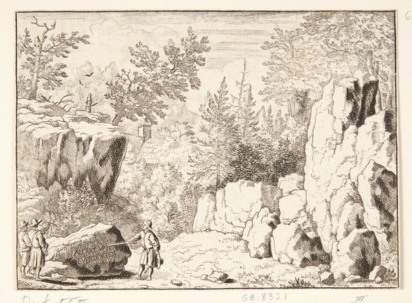
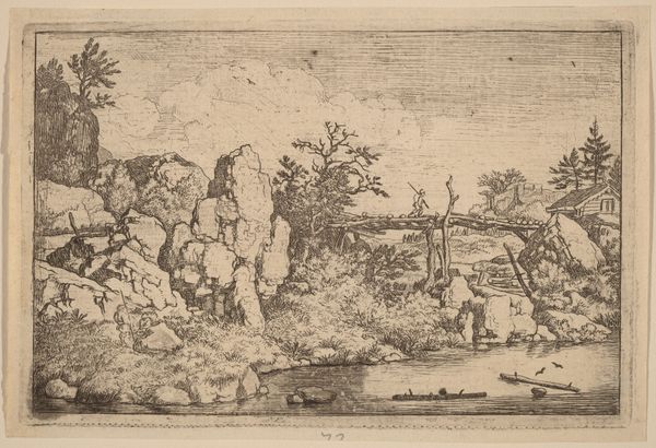
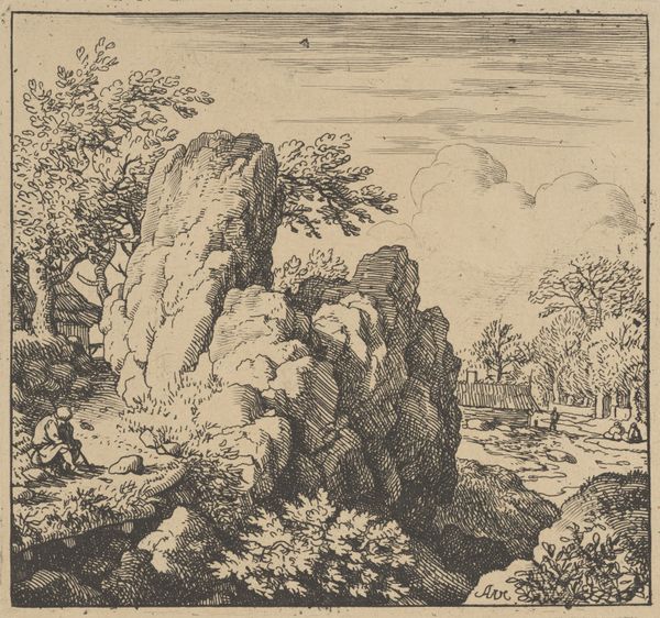
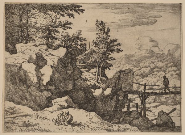
Editor: So, this is "The Inscription on the Rock" by Allart van Everdingen, dating back to the mid-17th century. It's a print, quite small but detailed. It gives off a very…stark impression, all craggy rocks and thin trees. What do you see in the composition that jumps out? Curator: The organization of forms creates a palpable tension. Notice the dense hatching used to render the rocks on the right, almost overwhelming in their mass, juxtaposed against the comparatively delicate and airy rendering of the foliage on the left. The three figures are rendered as flat silhouettes, devoid of volume. It’s almost as though they are simply another form within the natural elements. Editor: I see what you mean. The figures look flat in contrast. Is there significance to the overall texture and interplay between light and dark? Curator: The contrast is fundamental to the reading of the landscape, almost as if there is no human drama. Examine how the use of line modulates – short, repetitive strokes building volume on the stone, longer flowing marks defining branches and shadows. Observe the spatial relationships; it gives you a feeling that the landscape is the main focus of the art. Do you notice the human is just one of many features, seemingly less important. What do you see? Editor: Yes! It’s as if they are dwarfed by the immensity of the scene. I hadn’t thought about the different lines creating this effect, making one realize the forms’ monumentality versus fragility. I have found a new perspective after considering the composition's formal qualities. Curator: And the exploration of form reveals aspects one might not see upon an initial glance. There's something powerful in the work.
Comments
No comments
Be the first to comment and join the conversation on the ultimate creative platform.
More like this