#
studio photography
#
product studio photography
#
natural stone pattern
#
antique finish
#
old engraving style
#
product fashion photography
#
retro 'vintage design
#
wood background
#
metallic object render
#
golden font
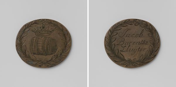
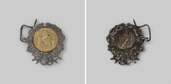
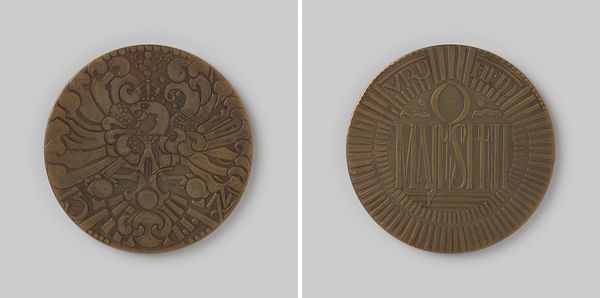
Dimensions: height 3.7 cm, width 5 cm, weight 28.78 gr
Copyright: Rijks Museum: Open Domain
Editor: This is the Bierbeschooiersgilde van Amsterdam, gildepenning van Willem Losser, dating from approximately 1650 to 1800. What immediately grabs my attention is its ovoid form and the contrasting imagery on each side. One side features a barrel and a crown, while the other side displays elegant calligraphy. How do you interpret this piece, focusing on its structural and formal qualities? Curator: The piece presents a fascinating duality. The symmetrical laurel wreath that encloses both images lends a structural harmony to the piece. However, the images enclosed create a certain tension. The side with the barrel and crown evokes power and commerce. Editor: Power and commerce... because of the guild aspect? Curator: Precisely. And consider the contrast between the static symbolism of the barrel and crown and the dynamic script of Willem Losser's name on the reverse. Do you notice how the laurel wreath almost acts as a visual frame, drawing the eye inward towards these contrasting elements? Editor: Yes, now I see it. It is a powerful framing device, leading you to carefully inspect the different components. The script almost looks as though it has more energy than the barrel illustration! Curator: Indeed. Also, note the engraved lines. These marks possess significant value within the broader aesthetic composition, as their rhythmic placement leads to visual interest. The texture contributes a tactile dimension that enlivens the medallion's surface. Editor: So the contrasting elements and the textured surfaces all contribute to a harmonious whole. The semiotics certainly open many avenues for analysis. Curator: Precisely! Viewing the penning from this viewpoint permits us a more thorough engagement with its inherent characteristics and visual dialect.
Comments
No comments
Be the first to comment and join the conversation on the ultimate creative platform.
More like this