drawing, paper, ink, architecture
#
drawing
#
dutch-golden-age
#
old engraving style
#
paper
#
ink
#
romanticism
#
architecture
#
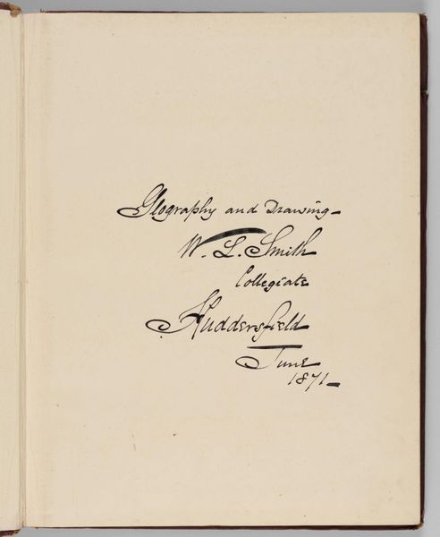
calligraphy
Copyright: Rijks Museum: Open Domain
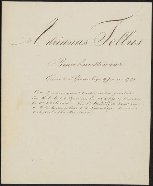
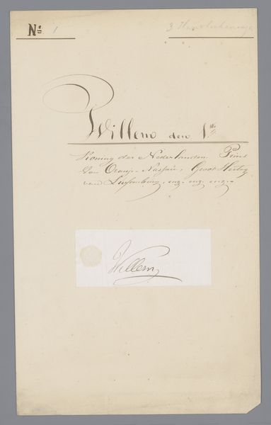
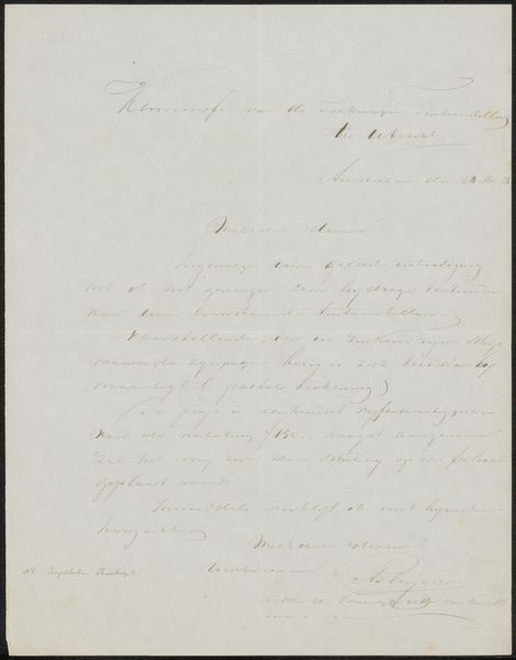
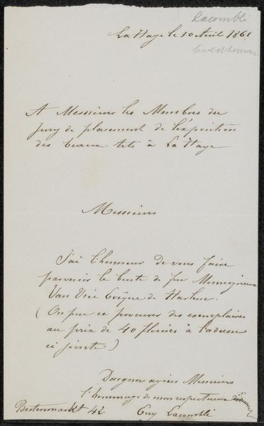
Curator: We're looking at a handwritten document, "Handschrift betreffende Adriaan Noordendorp," created between 1790 and 1833 by an anonymous artist, executed in ink on paper. The delicate line work immediately catches the eye. Editor: It feels rather restrained. Almost bureaucratic in its formal presentation, yet there’s a beauty in the sheer elegance of the script. The curves seem so deliberate and mannered. Curator: Precisely. The calligraphy functions beyond mere legibility; the looping ascenders and descenders create a visual rhythm. It echoes architectural drafting, considering the document concerns Adriaan Noordendorp. Editor: Indeed! His name floats above, proclaiming his importance, especially coupled with the reference to being a 'bouwmeester,' a master builder of royal palaces and national buildings. We see pride woven through symbolic declarations. It grounds him and us. Curator: Notice, too, how the darker, heavier strokes emphasize key words. These bold contrasts create a clear visual hierarchy within the otherwise subtle texture of the overall image. Editor: Those shifts in weight suggest a considered pace of inscription, perhaps a meditation on the act of record-keeping itself. Bureaucracy elevating itself! A beautiful irony if this is meant for some mundane, practical use, don’t you think? Curator: I find the blank space around the text fascinating. It isolates the script, creating a sense of reverence for the information presented. The negative space becomes active, drawing attention to the meticulous details within. Editor: The sparseness focuses us on the enduring role of building within societal identity and ambition through carefully chosen textual anchors. The calligraphic design acts almost like a carefully considered family crest. Curator: Studying this script prompts reflections on our evolving relationships with writing, and perhaps also the transition to mass-produced documentation. Editor: Agreed. And the careful application in monochrome reinforces that somberness while celebrating this master builder of grand institutions. An emotional connection, however subtle, endures through time.
Comments
No comments
Be the first to comment and join the conversation on the ultimate creative platform.
More like this