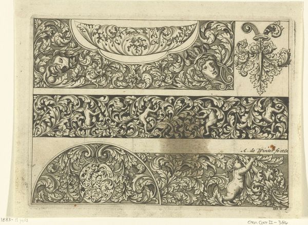
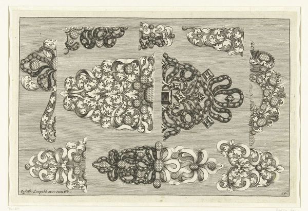
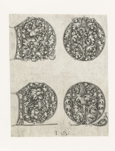
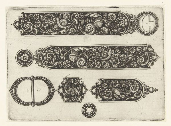
graphic-art, print, intaglio, typography, engraving
#
graphic-art
#
pen drawing
# print
#
pen illustration
#
pen sketch
#
intaglio
#
old engraving style
#
form
#
typography
#
pen-ink sketch
#
line
#
pen work
#
northern-renaissance
#
decorative-art
#
engraving
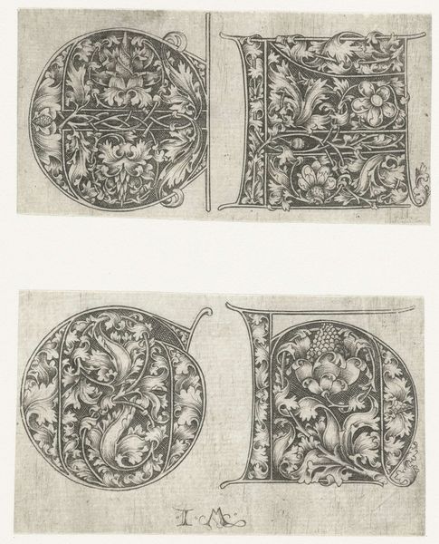
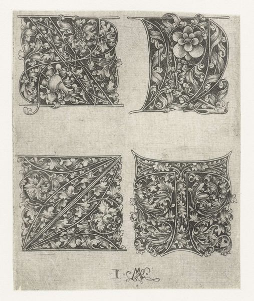
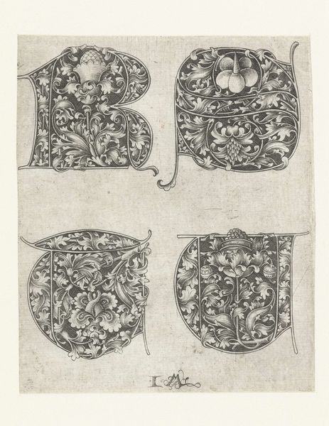
Dimensions: height 126 mm, width 113 mm
Copyright: Rijks Museum: Open Domain
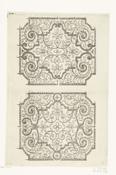
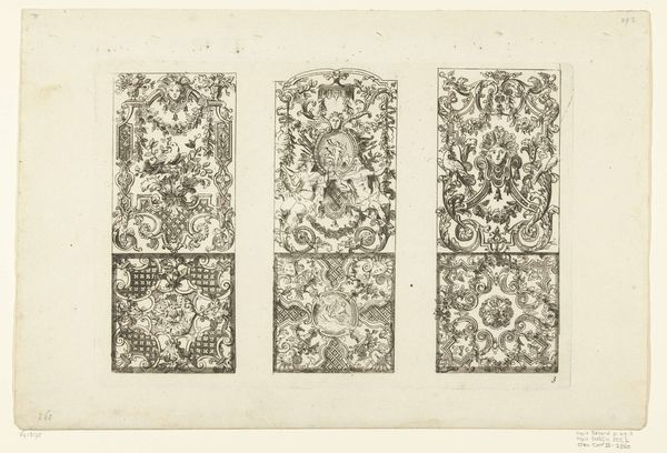
Curator: Here we have "Hoofdletters I, K, L en M," or "Majuscules I, K, L, and M," a print made between 1455 and 1503 by Israhel van Meckenem, now held in the Rijksmuseum collection. Editor: My first thought? Wow, look at the sheer intricacy! Each letter bursts with life, almost overgrown with foliage. It feels like stumbling upon a secret, illuminated garden. Curator: Indeed. Meckenem was a prolific printmaker. What strikes me is the meticulous process. These are engravings, meaning the design is cut into a metal plate. The physical act of creating those fine lines, that repetitive labor... it speaks to the value placed on skilled craft. The printing press democratized text, and decorative typography like this elevated the book as a luxury commodity. Editor: Absolutely. We often overlook the social implications of something like typography. This piece is definitely more than "just letters." Imagine the literacy rate at the time. To create such elaborate letters suggests that access to the written word—even artistically rendered—carried an enormous privilege. The floral motifs, though beautiful, were meant for an elite that enjoyed luxury while most laborers experienced backbreaking farm labor, void of this floral leisure. Curator: A key consideration, as is the production context. Meckenem was working in a society that saw the rise of powerful printing families, craft guilds, and the developing book trade. Understanding these workshops helps us rethink distinctions between high art and the applied arts. Editor: Precisely! These aren't simply aesthetic objects. Consider the implications of consuming this artwork—engravings served as prototypes or inspiration for other luxury goods and as affordable alternatives to paintings, enabling these upper-class citizens to construct a worldview from the images surrounding them. Who was being given access to the production of meaning, and in what context? Curator: It shows how we often neglect to appreciate the material process by which beauty and knowledge become popularized. Editor: Looking at this artwork makes me think that understanding the power structures during the time that this was created is what will truly provide it context. Curator: So, it shows us that appreciating the sheer dedication, the hours spent engraving these letters also requires acknowledging its historical circumstances, in order to analyze a more comprehensive picture of this society. Editor: Yes, and hopefully spark conversations that invite inclusivity and a broader understanding of what images like this mean today.
Comments
No comments
Be the first to comment and join the conversation on the ultimate creative platform.
More like this