print, etching, engraving
#
narrative-art
# print
#
etching
#
figuration
#
line
#
history-painting
#
engraving
Dimensions: height 396 mm, width 313 mm
Copyright: Rijks Museum: Open Domain
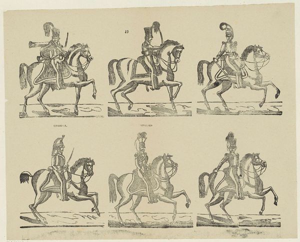
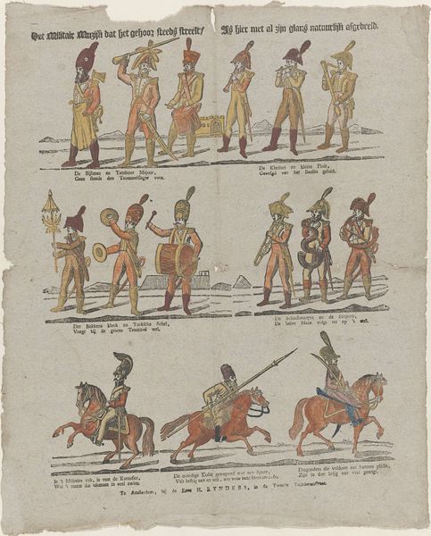
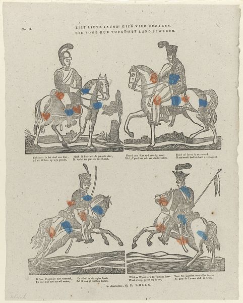
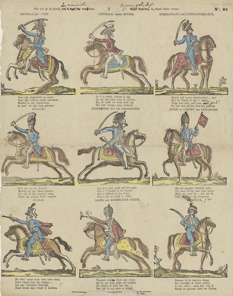
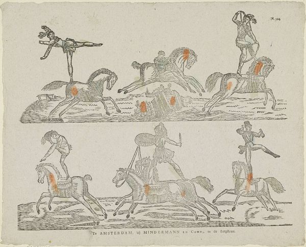
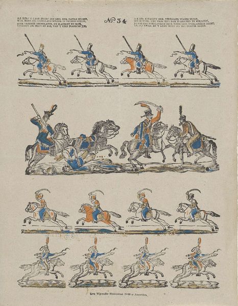
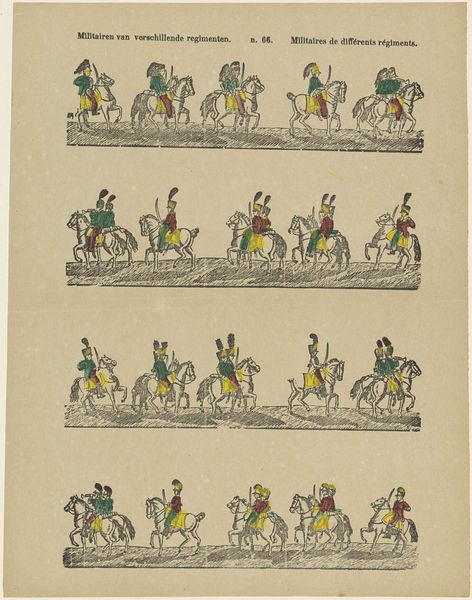
Editor: Here we have Willem Carl Wansleven's "Bataille van Waterlo," made sometime between 1806 and 1858. It's a print, using both etching and engraving. It's really intriguing, almost like a storyboard about a battle! What stylistic choices stand out to you in this piece? Curator: The composition adheres to a rigorous structuring principle. The work can be viewed as a series of distinct pictorial fields, each representing a key figure or element of the battle. Note how line predominates. Its quality and density are the key signifiers, generating both form and texture. The use of line dictates our perception, wouldn’t you agree? Editor: I do. The figures and the landscapes are all created with such defined outlines. It's very graphic in that sense. Why divide the print in that way instead of one battlefield scene? Curator: The compartmentalization encourages a comparative analysis. For example, we are asked to weigh the presentation of “Vorst von Blucher” against that of “De Hertog van Brunswyk.” How does the handling of line and form differentiate them? Are they equivalent in visual terms? Editor: Now I see it! There's almost an implicit hierarchy being presented through composition and detail. Brunswyk, in his chaotic defeat, gets a very different treatment than Blucher! I hadn't thought about comparing each field. Curator: Exactly! This invites us to scrutinize not only what is depicted but also how it is depicted. Wansleven seems to be commenting on specific details rather than a general depiction of battle. Editor: This deep dive into the lines and boxes made me realize that the image is far more articulate and specific than I initially assessed. Curator: Precisely. It is through formal analysis that we unveil the intentions embedded within the artwork.
Comments
No comments
Be the first to comment and join the conversation on the ultimate creative platform.
More like this