watercolor
#
medieval
#
narrative-art
#
landscape
#
figuration
#
watercolor
#
mixed media
#
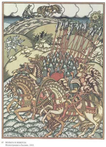
watercolor
Copyright: Public domain
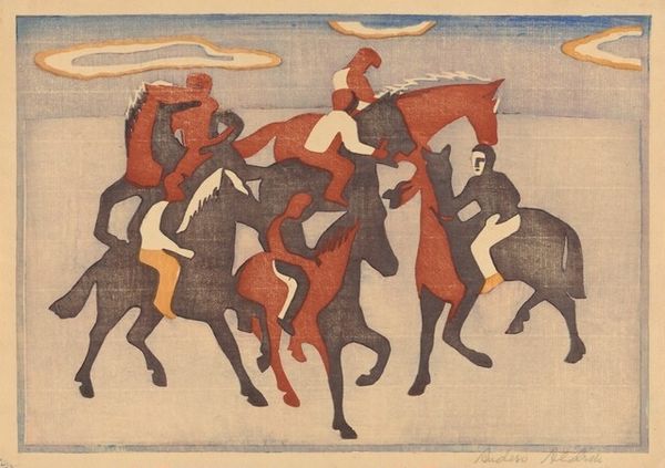
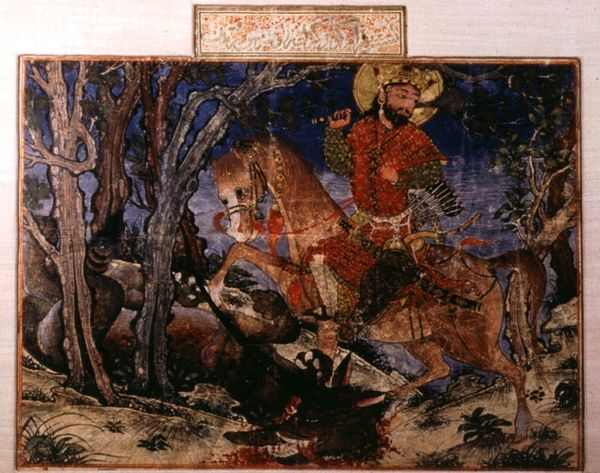
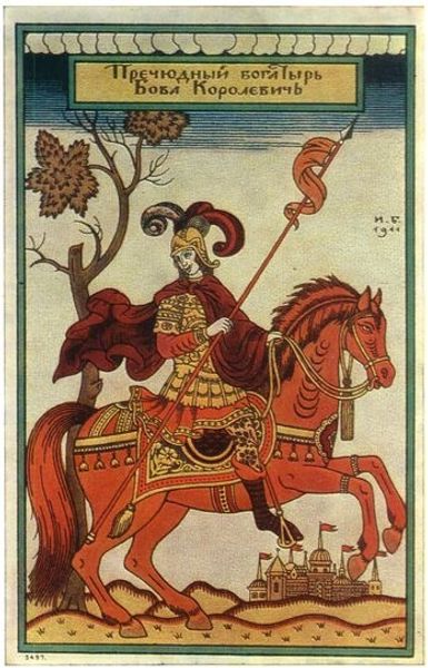
This is an illustration to ‘The Song of Roland’, by Heorhiy Narbut. The colours in this are so muted, earthy, almost like they’ve been aged by time, with these gorgeous ochres and greens dominating the palette. I love how the artist uses colour and line to create these almost flat, decorative forms. It feels really considered. Look at the texture here; the way the paint seems to have been dragged across the surface, creating these tiny striations and imperfections. See how the artist layers these colours, allowing them to bleed into one another, creating this sense of depth and atmosphere. I especially love the way the artist delineates the horses legs, there is something so sensitive and delicate about it. You can almost feel the artist’s hand moving across the page, making these intuitive decisions about where to place each mark. Narbut brings to mind other artists interested in a similar form of simplification such as Paul Klee. And like Klee, Narbut is happy for there to be an ambiguity around the artwork, a sense that there are multiple interpretations, rather than one fixed meaning.
Comments
No comments
Be the first to comment and join the conversation on the ultimate creative platform.
More like this