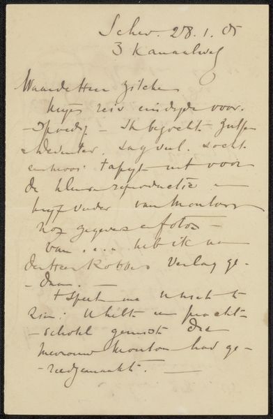
drawing, paper, ink
#
portrait
#
drawing
#
paper
#
ink
#
modernism
Copyright: Rijks Museum: Open Domain
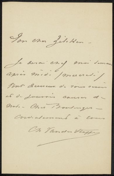
Editor: This is "Brief aan Philip Zilcken," possibly created between 1917 and 1921 by Fredericus Jacobus van Rossum du Chattel. It’s a drawing, rendered in ink on paper. The cursive script gives the whole composition a feeling of graceful movement. What stands out to you most about the artwork? Curator: It is indeed the line, its quality and direction, which provides the initial and lasting visual experience. Notice how the artist uses the varying thickness of the ink line to articulate form, directing the viewer's eye across the surface. The pressure applied creates a dynamic rhythm, a kind of calligraphic dance across the page. Consider how the positive and negative spaces interact; the words form shapes, the intervals create another dimension. The formal elements create their own visual interest apart from the text. Editor: I see what you mean about the interplay between the lines and the space around them. Do you think the meaning of the text factors into how we interpret these formal qualities? Curator: While the semantic content certainly provides context, formalism directs our attention to the artwork itself. The act of reading becomes a visual experience foremost, shaped by line and form. We contemplate texture over the actual meaning. Observe, how the contrast of thick and thin strokes embodies tonal variation to bring harmony. How the density influences our perception beyond textual meaning. What do you make of the composition? Editor: It seems deceptively simple. Just text on a page. But hearing you talk about it, I'm seeing so much more in terms of line quality and shape than I did initially. I will attempt to analyze the line work in the next artwork we discuss, thanks. Curator: And I was prompted to see language's plastic potential thanks to you. A rewarding experience indeed.
Comments
No comments
Be the first to comment and join the conversation on the ultimate creative platform.
More like this