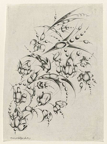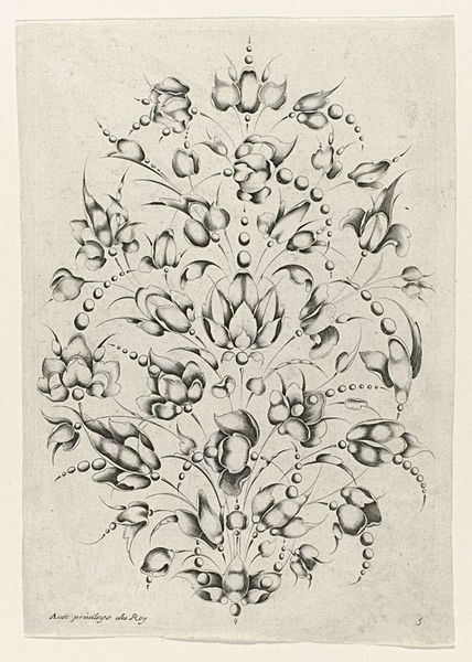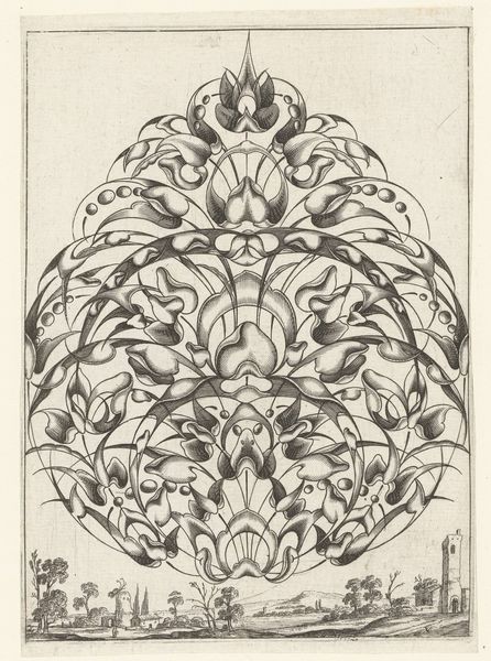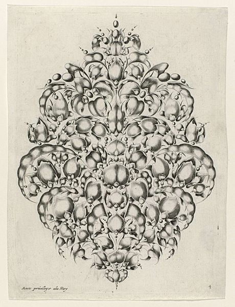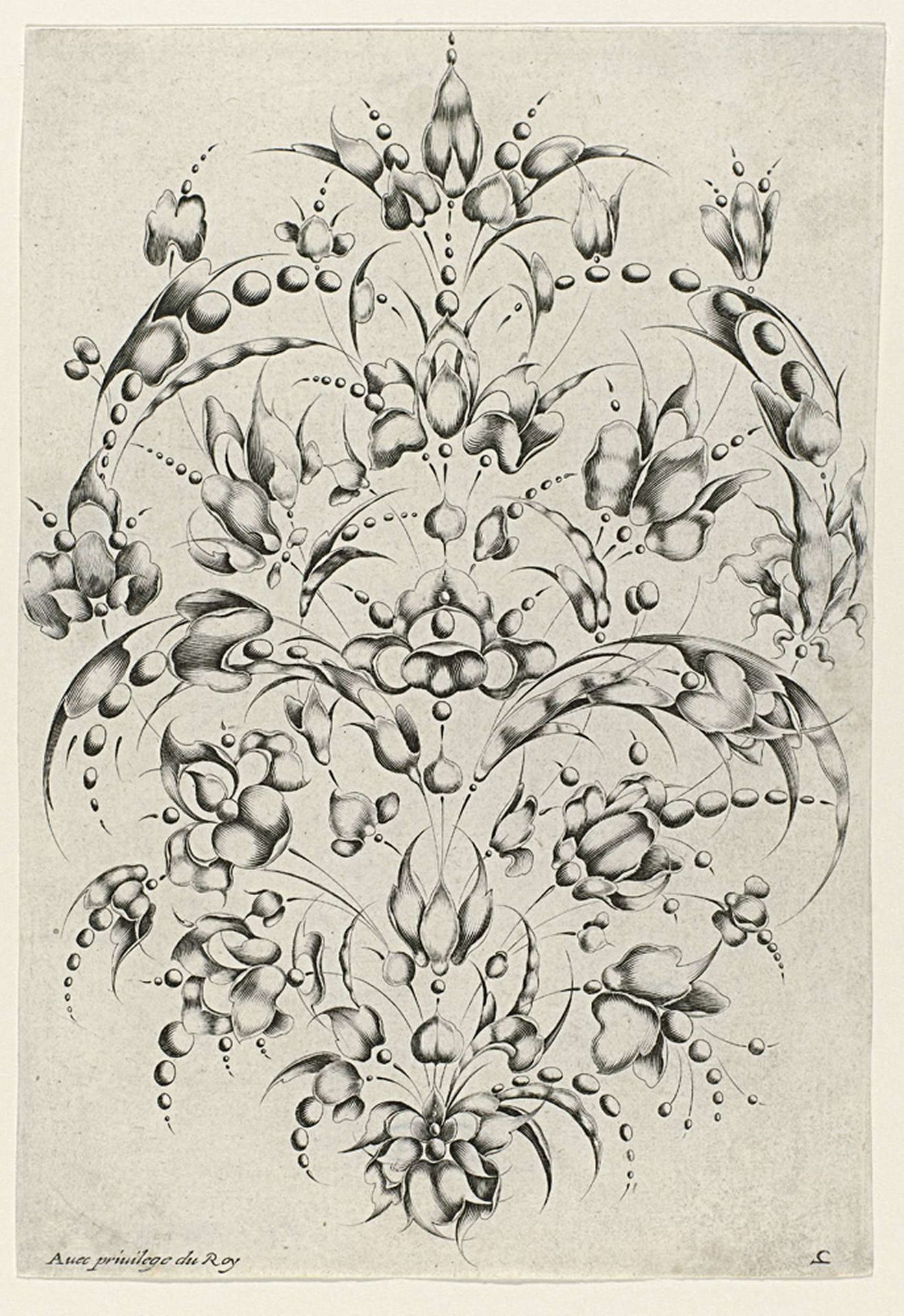
1627
Cosse-de-pois ornament voor goudsmeden
Listen to curator's interpretation
Curatorial notes
Curator: Look at this remarkably ornate drawing. It’s entitled “Cosse-de-pois ornament voor goudsmeden,” or "Pea Pod Ornament for Goldsmiths," and was created around 1627 by Jacques Briot. Editor: Intricate. My first impression is that the use of light and shadow is masterful, creating almost three-dimensional forms with simple lines and ink. It's visually dense but the symmetry is comforting. Curator: It is Baroque in style, but I see in its geometric construction a reference to earlier emblem books and the use of symbols in Renaissance jewelry, like seeds that embody potential and peas associated with abundance. This piece may also be an allusion to Royal privilege as well. Editor: I'm more intrigued by how the arrangement emphasizes its individual elements. Notice how the play of concave and convex shapes adds dynamism, yet the rhythmic repetition of the forms keeps the overall design stable and balanced. The material rendering creates a sense of volume using just line and wash. Curator: Consider that these ornaments, rendered with pen and ink, were intended as a pattern for goldsmiths. In a way, Briot provides the visual language to manifest specific aspirations related to family, prosperity, or spirituality, aligning individual desires with societal expectations through codified imagery. Editor: You can also read the work in terms of formal harmony. The curved lines soften the geometry, guiding the eye, while the tonal gradations enhance its almost sculptural depth. It suggests movement and vitality even within a static medium. Curator: It's intriguing how Briot transforms a simple design element—the pea pod—into an object capable of expressing deeper human aspirations and a vision of Royal privilege. Editor: The visual rhythm and harmonic balance speak for themselves. I see here a celebration of design’s power to stimulate emotion using fundamental shapes and skillful lines.