abstract-expressionism
washington-colour-school
geometric
geometric-abstraction
line
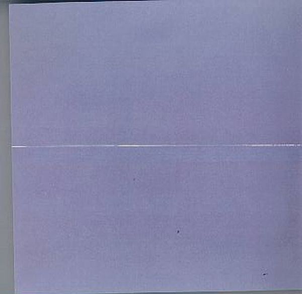
Copyright: Sam Gilliam,Fair Use
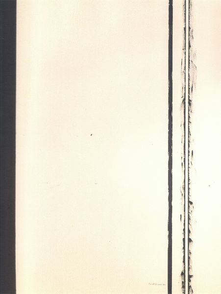
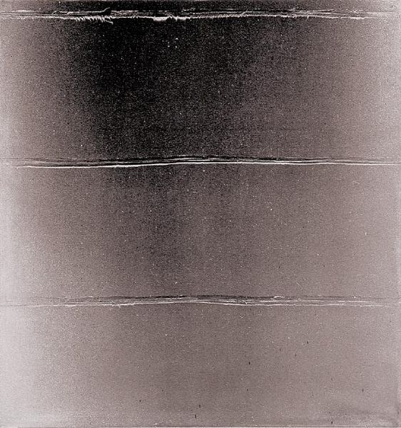
Sam Gilliam made Tempo as an exercise in rhythm, and the simple monochrome gives it a feeling of space. Look closely, and you can see it’s all about the gesture. Gilliam isn't afraid to leave traces of his process right there on the canvas. The way those lines aren’t perfectly straight, they waver ever so slightly. That’s not a mistake, that’s life! I love how he lets the paint do its thing. It's like he’s saying, "Hey, I'm here, but so is the paint, and it has a voice too." The color is really understated and that makes you notice the texture even more. Those lines, how they catch the light – it's almost sculptural, isn't it? It reminds me a bit of Agnes Martin, that quiet intensity. And like her work, Gilliam proves that sometimes, less really is more.
Comments
No comments
Be the first to comment and join the conversation on the ultimate creative platform.