Curatorial notes
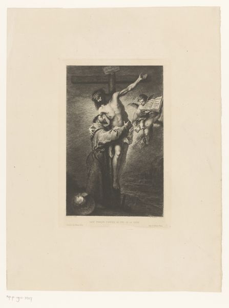
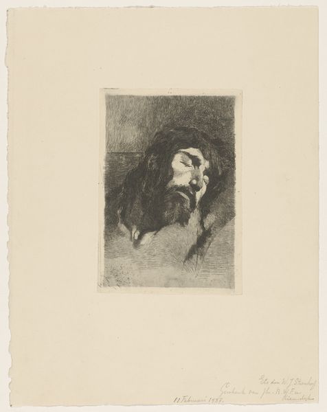
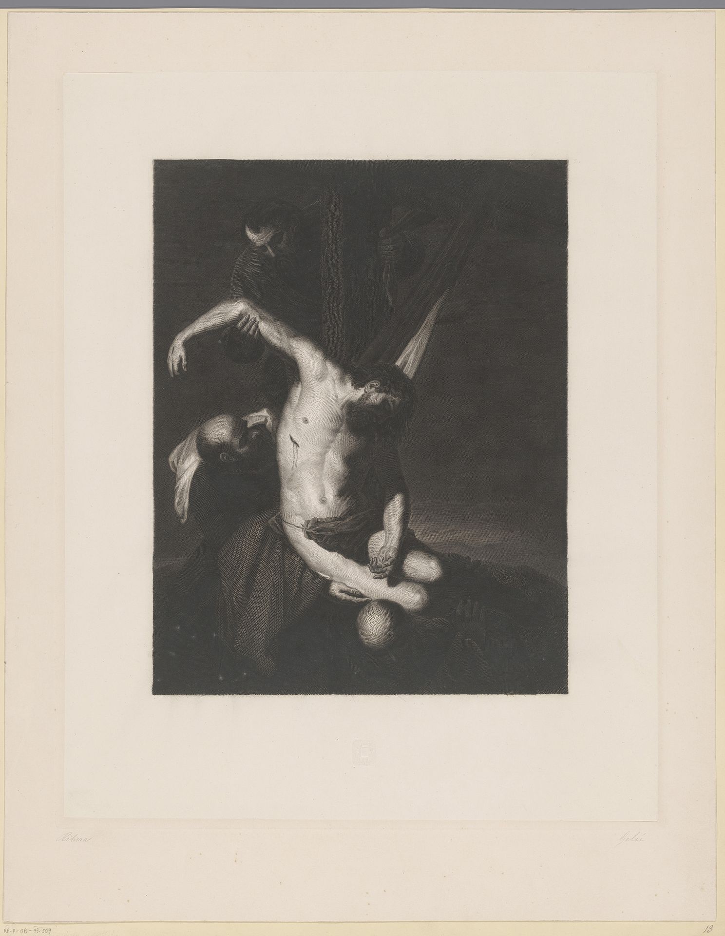
Editor: This engraving, "Kruisafname," created sometime between 1806 and 1860 by Antoine François Gelée, is striking in its dramatic use of light and shadow. The dark tones really create a somber and intense mood. What catches your eye in terms of its composition? Curator: Indeed, the chiaroscuro is paramount. Notice how the stark contrast isn’t merely illustrative; it’s structural. It guides the viewer's eye, creating a focal point around Christ's body. The diagonal of the cross reinforces a dynamic instability, characteristic of Romanticism’s break from Neoclassical serenity. Editor: So, it’s more than just aesthetics? Curator: Precisely. The dramatic lighting dissects and highlights key components such as his torso which contributes directly to its narrative and the implied movement of the scene. Think about the use of line. How does the engraver’s mark-making contribute to the overall affective quality? Editor: I see what you mean; the varying line weights definitely intensify certain emotions. The strong dark lines really add to the tragic feel, versus delicate thin ones. Is it possible to focus just on this kind of purely aesthetic examination to engage with this work, versus engaging with its religious meaning? Curator: Absolutely. Formalism encourages us to isolate the visual elements. By suspending immediate recourse to symbolic interpretation, the structural integrity becomes profoundly apparent, rendering an artwork autonomous in its power. That starkness emphasizes the emotional power in an image completely separate from narrative considerations. What do you take away from this understanding? Editor: Thinking about it now, appreciating it as a structure first really adds a dimension. Now I can see other compositions this same method might apply to! Curator: And, remember that even absence plays a role.