drawing, mixed-media, print
#
art-deco
#
drawing
#
mixed-media
# print
#
figuration
Dimensions: height 246 mm, width 189 mm
Copyright: Rijks Museum: Open Domain
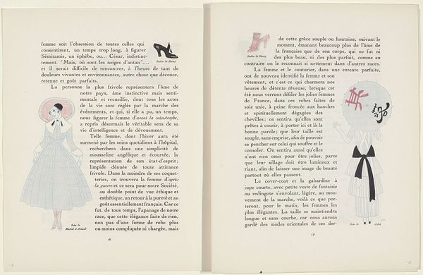
Georges Lepape made this layout for Gazette du Bon Ton using pen and ink, and the playful ease with which he combines text and image is just so inspiring. It’s like the whole page is a stage, and the text and image are characters in a witty performance. Look at how Lepape uses a limited color palette—mostly pinks and blues—to create a feeling of lightness and airiness. The simple plaid pattern seems to lift the figure off the page, giving her a sense of freedom. Notice how the lines are not perfectly straight, they have a gentle wobble that adds to the human feel of the piece. That little knot at the bottom of her dress, where the plaid comes together, is so carefully placed. It serves as the focal point. It's almost as if he's winking at us, reminding us not to take fashion, or ourselves, too seriously. Think of the prints of Sonia Delaunay, who explored similar themes of color and pattern in her clothing and textile designs. Lepape reminds us that art is always a conversation, echoing through time and across different forms.
Comments
rijksmuseum over 1 year ago
⋮
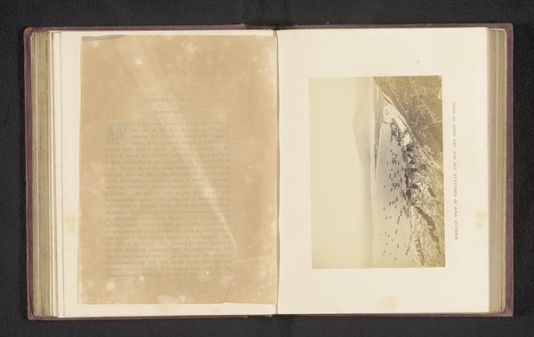
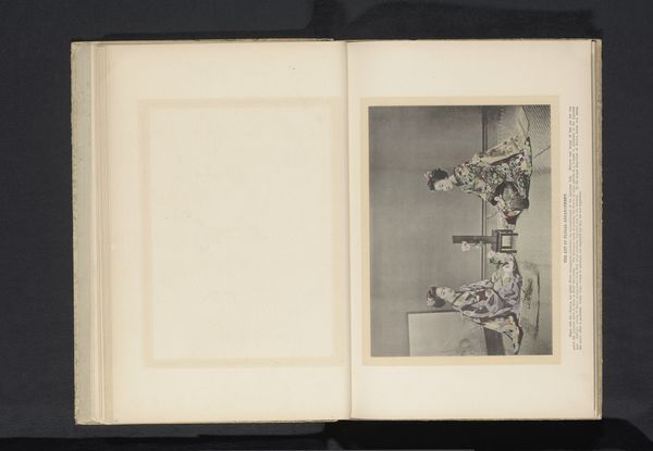
The Gazette du Bon Ton was about more than just fashion. It was also a treat for the eyes for typographers and graphic designers. Texts and illustrations were arranged to form a harmonious whole. Rather daringly, large illus-trations often occupied an entire double-page spread.
Join the conversation
Join millions of artists and users on Artera today and experience the ultimate creative platform.
More like this