Copyright: Modern Artists: Artvee
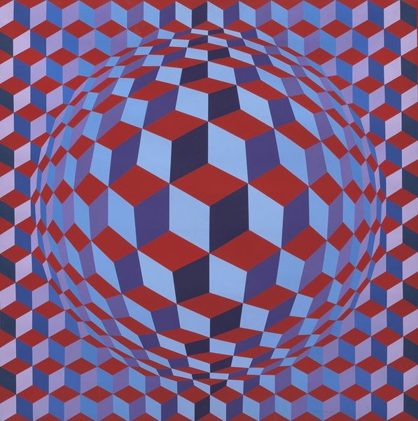
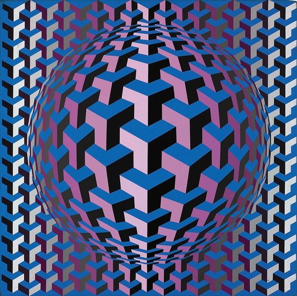
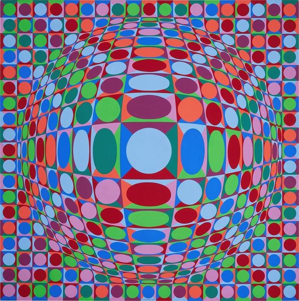
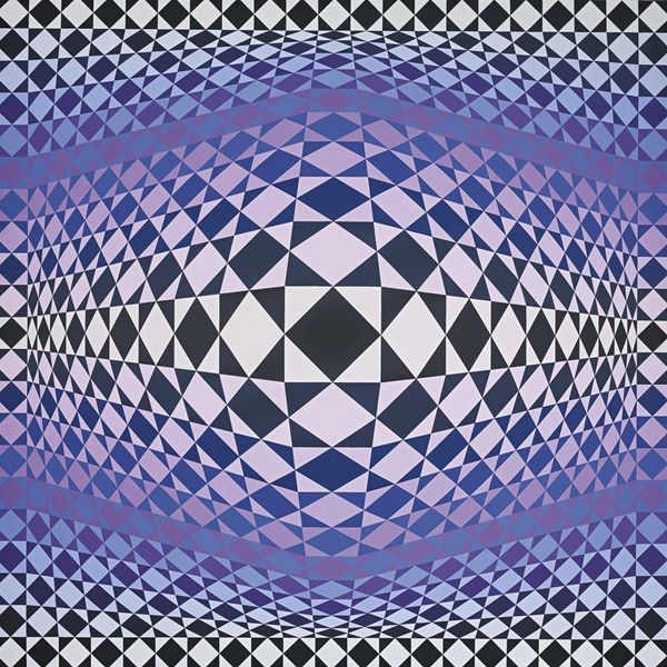
Editor: Here we have Victor Vasarely's "Pulsar – red firma," created in 1972 using acrylic paint. It immediately strikes me as a really powerful visual illusion, almost making the wall itself seem to warp. What’s your take on this work? Curator: That’s a fantastic initial read. The visual pull reminds me of how certain symbols embedded in our subconscious can trigger immediate, almost primal reactions. Consider the title, "Pulsar." It evokes a celestial energy source, radiating outward. Notice how Vasarely uses color. Editor: The blues and oranges are very bold and vibrant! Curator: Exactly. The geometric cubes, in this context, transcend mere shape. The cube itself has long held symbolic weight, representing stability, the earth, the grounded. Yet here, through the shifting colors and warped grid, that stability seems to disintegrate, almost like the energy of the Pulsar is breaking apart these notions. It's as if the painting visually represents both cosmic order and chaotic energy, simultaneously. Do you sense that interplay between order and chaos? Editor: I do see that tension now, particularly how the background grid contrasts with the central sphere. Curator: It makes you question the supposed 'grounded' reality, doesn't it? Vasarely cleverly plays on this contrast, triggering a response. This dynamic hints at underlying currents and forgotten mythologies around color symbolism. It pushes viewers to think about reality’s nature as potentially unstable or mutable, beyond appearances. Editor: This has really changed how I view the piece. I thought it was just a neat illusion, but it’s so much more! Curator: It reveals how abstract shapes can contain potent layers of symbolic meaning, constantly reshaping our understanding.
Comments
No comments
Be the first to comment and join the conversation on the ultimate creative platform.
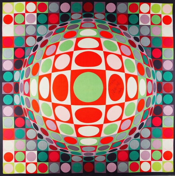
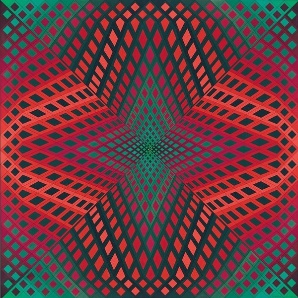
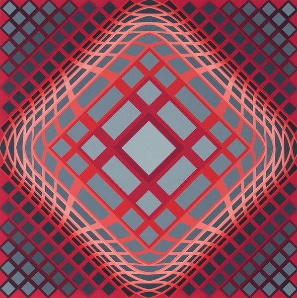
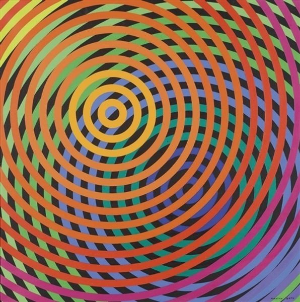
More like this