Dimensions: height 344 mm, width 425 mm
Copyright: Rijks Museum: Open Domain
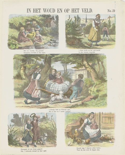
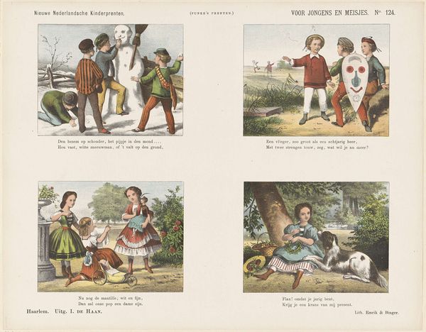
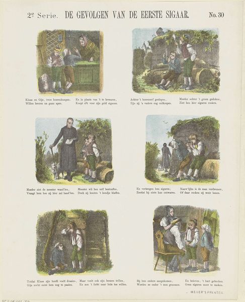
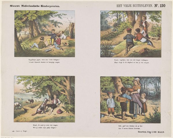
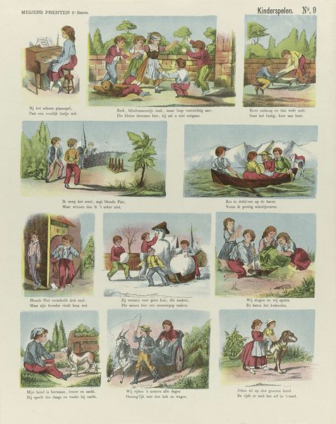
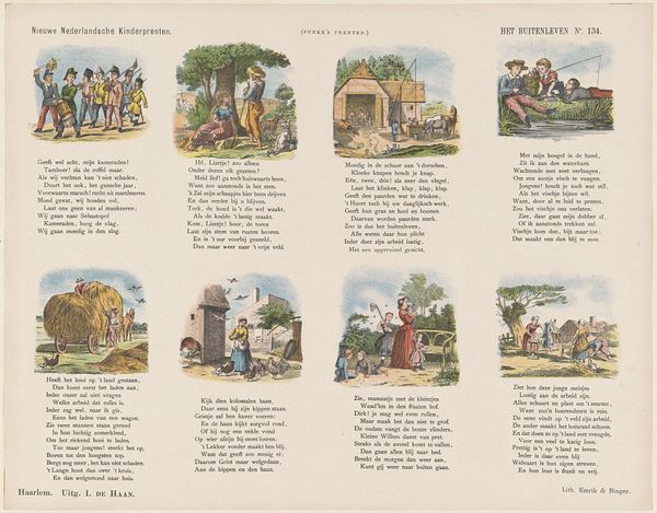
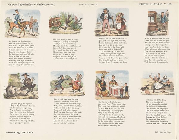
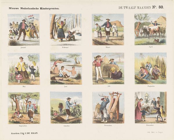
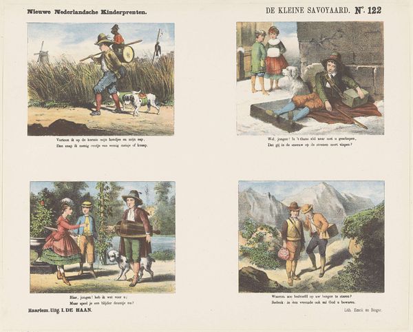
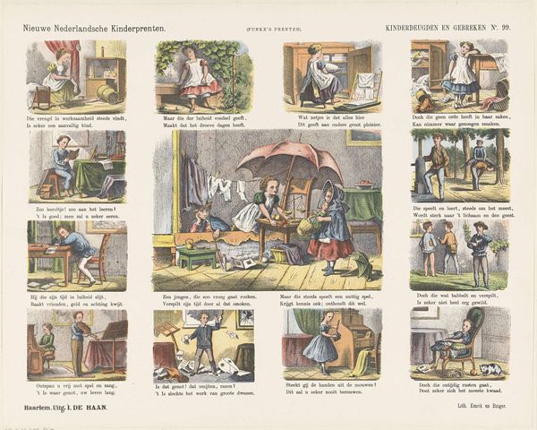
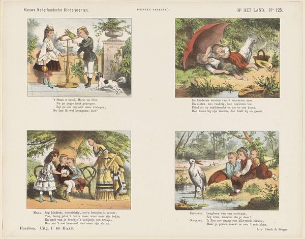
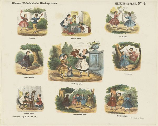
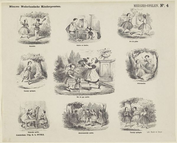
Editor: Here we have Jan de Haan's "Vacantie pret," created sometime between 1875 and 1903, using drawing, print, ink, and pencil on paper. It’s interesting how the print is separated into four different vignettes, almost like panels from a comic strip. As a whole, it evokes a sense of playful, childlike freedom. As a formalist, what do you see in this work? Curator: Let's consider how the composition directs our attention. Observe how each vignette employs a central vanishing point, subtly drawing the eye inward. Note the restricted palette; the artist deliberately limits the tonal range to enhance a sense of harmony and order. Are you struck by the recurring motif of play? Editor: Yes, definitely! I see kids playing with different objects—toy weapons, a goat-pulled cart, boats… each scene capturing a different aspect of childhood amusement. Curator: Precisely. And consider how De Haan uses line to delineate form. Observe the crispness of the outlines. The figures possess a degree of anatomical correctness but are also stylized, serving the image’s narrative clarity. How would you assess the image's balance? Editor: It's quite balanced, each of the four images is positioned equally in the artwork. There's repetition in the characters that are shown throughout, but varied by the stories in each. It isn't perfectly symetrical. Curator: Agreed. Also observe how the artist’s choice of medium reinforces this sense of clear boundaries and order, lending itself to the production of clean lines and distinct forms, typical of academic art. Editor: It’s fascinating to analyze this piece solely based on its visual elements. Thanks for highlighting those aspects. Curator: My pleasure. Focusing on the formal structure really enhances one’s appreciation, don’t you think?
Comments
No comments
Be the first to comment and join the conversation on the ultimate creative platform.
More like this