About this artwork
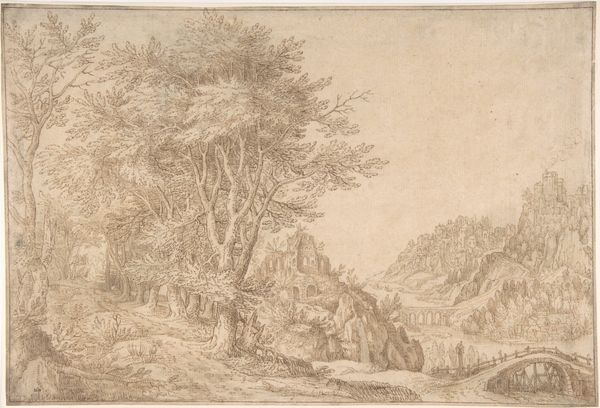
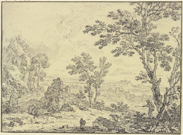
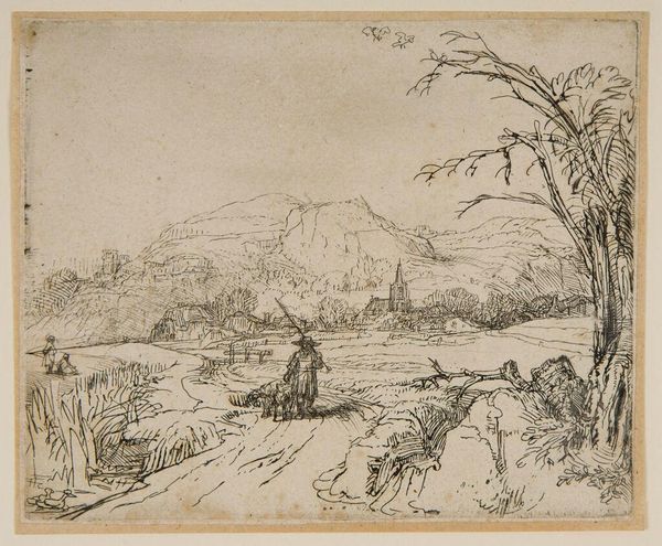
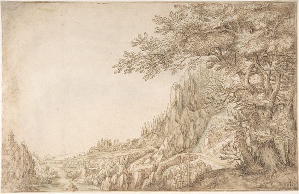
Editor: This is Giovanni Battista Busiri’s "River Landscape near Narni," likely created sometime between 1698 and 1757. It’s rendered in ink, as an etching. I'm struck by the delicate quality of the lines, creating a sort of ethereal atmosphere. How do you approach a work like this, focusing on the form itself? Curator: The graphic structure here is quite compelling. Note how Busiri utilizes cross-hatching, not just for shading, but also to delineate the recession of space. See how the density of lines increases in the foreground, then gradually thins as our eye moves toward the distant mountains? Editor: Yes, I see that now! It’s almost like he's using line weight to create depth, which feels sophisticated. Curator: Precisely. And observe the use of line direction: vertical strokes to suggest the height of the trees, horizontal to indicate the stillness of the water. Consider also the rhythmic repetition of forms. The curves of the trees echo the shape of the distant hills, creating a sense of visual harmony. Editor: It is quite harmonious! Does that simplicity help define it within the Baroque landscape tradition? Curator: The composition is less dramatic and more subdued than some Baroque landscapes. While there's a clear distinction between the light and dark areas, the lack of strong diagonals gives it a calmer, more measured feel. He seems to favor a contemplative arrangement rather than overt emotionalism. It prioritizes formal relations to represent an atmosphere. Editor: This piece does now feel like less of a purely representational depiction of scenery and more of an exercise of visual principles. Curator: Indeed, sometimes a work reveals more of itself the closer you examine its formal structures and their ability to shape perception.
River Landscape near Narni
1698 - 1757
Giovanni Battista Busiri
1698 - 1757The Metropolitan Museum of Art
Metropolitan Museum of Art, New York, NYArtwork details
- Medium
- drawing, print, etching, ink
- Dimensions
- 10 7/8 x 16 1/2in. (27.6 x 41.9cm)
- Location
- Metropolitan Museum of Art, New York, NY
- Copyright
- Public Domain
Tags
Comments
Share your thoughts
About this artwork
Editor: This is Giovanni Battista Busiri’s "River Landscape near Narni," likely created sometime between 1698 and 1757. It’s rendered in ink, as an etching. I'm struck by the delicate quality of the lines, creating a sort of ethereal atmosphere. How do you approach a work like this, focusing on the form itself? Curator: The graphic structure here is quite compelling. Note how Busiri utilizes cross-hatching, not just for shading, but also to delineate the recession of space. See how the density of lines increases in the foreground, then gradually thins as our eye moves toward the distant mountains? Editor: Yes, I see that now! It’s almost like he's using line weight to create depth, which feels sophisticated. Curator: Precisely. And observe the use of line direction: vertical strokes to suggest the height of the trees, horizontal to indicate the stillness of the water. Consider also the rhythmic repetition of forms. The curves of the trees echo the shape of the distant hills, creating a sense of visual harmony. Editor: It is quite harmonious! Does that simplicity help define it within the Baroque landscape tradition? Curator: The composition is less dramatic and more subdued than some Baroque landscapes. While there's a clear distinction between the light and dark areas, the lack of strong diagonals gives it a calmer, more measured feel. He seems to favor a contemplative arrangement rather than overt emotionalism. It prioritizes formal relations to represent an atmosphere. Editor: This piece does now feel like less of a purely representational depiction of scenery and more of an exercise of visual principles. Curator: Indeed, sometimes a work reveals more of itself the closer you examine its formal structures and their ability to shape perception.
Comments
Share your thoughts