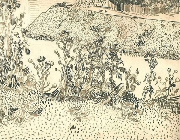
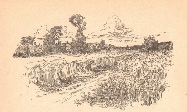
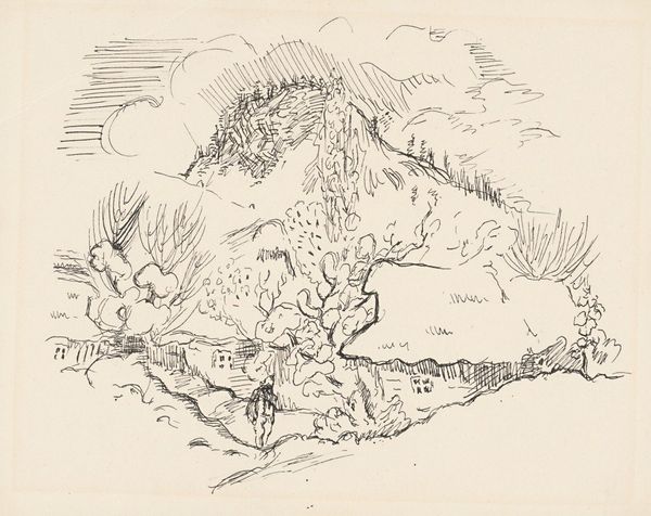
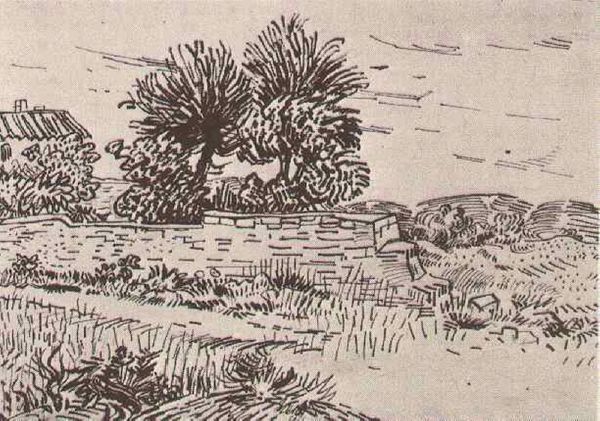
Illustrations for Mikhail Stelmakh's book "In the Hedgehog's Windmill" 1956
0:00
0:00
drawing, paper, ink, pen
#
drawing
#
ink drawing
#
pen illustration
#
pen sketch
#
grass
#
landscape
#
paper
#
ink line art
#
ink
#
ink drawing experimentation
#
plant
#
pen-ink sketch
#
pen work
#
sketchbook drawing
#
pen
#
realism
Copyright: Hryhorii Havrylenko,Fair Use
Curator: Today we’re looking at an ink and pen drawing by Hryhorii Havrylenko titled "Illustrations for Mikhail Stelmakh's book 'In the Hedgehog's Windmill,'" created in 1956. Editor: It's rather small and unassuming, isn't it? But the quick, dense linework creates a palpable sense of texture. Almost a claustrophobic thicket, yet undeniably peaceful. Curator: The beauty here truly lies in the interplay of line and form. Note the economy of means. Havrylenko uses varied line weights and densities to define the planes of the foliage and create depth within a very shallow space. It's masterful restraint. Editor: Restraint perhaps reflecting the socio-political climate of Ukraine at the time? Socialist Realism dominated artistic expression, yet this image subtly hints at a wilder, more untamed landscape. The 'hedgehog's windmill' perhaps suggesting resilience, a small space for autonomous existence amid larger dominating structures. Curator: While I understand that interpretation, it seems to overemphasize the symbolic element at the expense of appreciating the artist's technical skill. Consider the use of negative space, the careful composition that draws the eye across the work, lingering on the varying heights and implied movement of the grassy landscape. Editor: But is technical skill separate from its socio-cultural embedding? The act of choosing a subject, particularly a humble patch of grass, can be read as a deliberate counterpoint to grand narratives imposed by Soviet art doctrine. A subversive quietness, wouldn't you say? Curator: A valid argument. Though one could just as easily see it as an affirmation of rural, Ukrainian identity, aligning it within the broader propagandistic project. The inherent ambiguity, the beauty, resides in the open potentiality of forms. Editor: So we agree, in the end. Despite differing in our interpretive focus, the humble charm and understated strength resonate—regardless of what meaning we choose to overlay. Curator: Indeed, a worthy addition for any devotee of graphic artworks.
Comments
No comments
Be the first to comment and join the conversation on the ultimate creative platform.
More like this