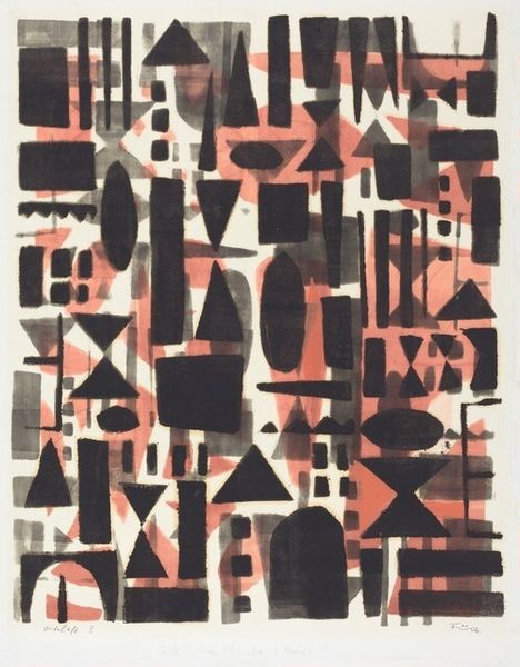
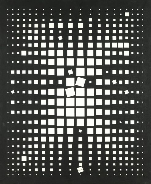
graphic-art, typography
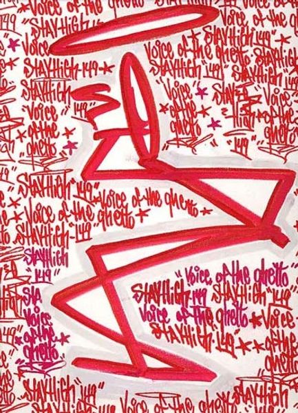
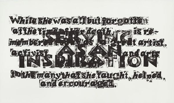
pattern out of typography
graphic-art
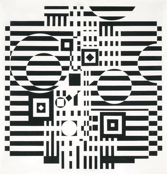
random pattern
typeface
pattern
op art
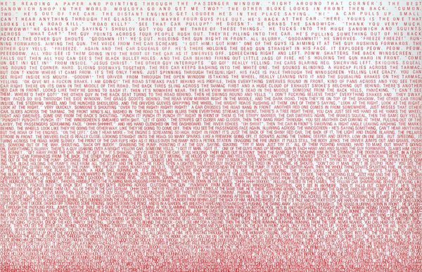
text
typography
organic pattern
simple pattern
thin text stroke
line
pattern repetition
varying line stroke
modernism
repetitive pattern
Copyright: Cassandre,Fair Use
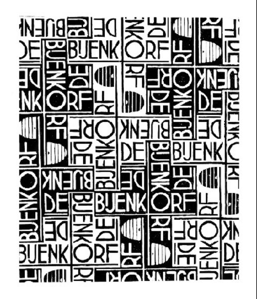
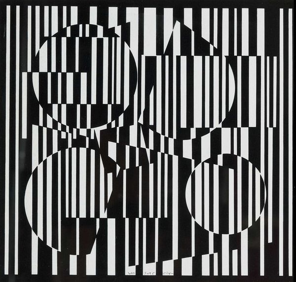
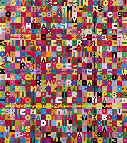
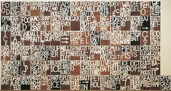
Curator: Take a look at "Bifur." I find myself utterly captivated. It's like a coded message, a visual poem constructed entirely from type. The phrases fight for dominance and become lost together within a whole new, yet still accessible, field of comprehension. Editor: Visually, it's incredibly striking. The black and white contrast is intense, creating a very active surface. It reminds me of those op-art pieces that play tricks on your eyes. I wonder, how does a design like this speak to society, given its style? Curator: Typography, and the broader world of graphic design, truly found its rebellious voice at the Bauhaus school. “Bifur,” embodies that rebellious spirit in graphic form; playing on pattern repetition, and making strong statements using basic design forms and techniques to transform familiar letters into something more expressive and disorienting. Editor: It's interesting you mention the Bauhaus, since there's an element of functionalism being subverted, don’t you think? Typography, typically a vehicle for conveying information clearly, becomes a barrier in a sense, precisely because of the repetitive text as it vies to hold our attention, obscuring our understanding. This tension - the promise of communication versus its frustrating delivery – I think is a social commentary. Curator: Precisely! What good is a word when all you can see is shape and form and abstract meaning? And how important can a phrase actually be if all the same words and meanings keep recurring? This gets at one of my deepest desires and darkest thoughts, this art, for if something must change it still stays exactly the same… Editor: Well, that does take things in a darker, more introspective direction. Looking at it from an historical angle, I'd be interested to know how pieces like "Bifur" were received. The text includes some variation of the phrases "to use Bifur," "the way to use Bifur" and "this is not." I wonder if the piece suggests commentary regarding the proper, or perhaps improper usage, or display of art itself? It asks us to interrogate these sorts of concepts through graphic language and repetitive forms that pull from the artistic movements happening around the work's creation. Curator: That's an incredible interpretation, because to "use Bifur" requires one to understand it, no? I find that many misunderstandings still create beauty, in a different form. Ultimately this piece, regardless of when it was created, makes you want to dance and shake around like you've just snuck into a haunted masquerade ball and cannot tell dream from reality. Editor: The experience of viewing art is undoubtedly altered with this in mind; thanks to pieces like "Bifur," the history and legacy of each artistic expression comes to the foreground and makes room for us to find unique appreciation for everything around us.
Comments
No comments
Be the first to comment and join the conversation on the ultimate creative platform.