Copyright: Public Domain: Artvee
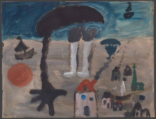
Curator: Here we have Paul Klee’s "Signs in the Sky," a mixed-media work created in 1924. The use of watercolor lends it a particularly ethereal quality. Editor: Ethereal is right; it feels like a half-remembered dream, almost unsettling. The color palette is muted, a dominant blue-gray, with these odd celestial shapes hovering above what looks like a landscape. Curator: Indeed. Klee masterfully juxtaposes the geometric with the organic. Notice the sharp, angular mountain range contrasted with the softer, rounded shapes that represent, perhaps, celestial bodies. There’s a calculated tension in this opposition. Editor: And it's precisely that tension that speaks to me. This piece was created during a time of great social and political upheaval in Germany. Do you think the celestial shapes could be interpreted as omens, harbingers of the turmoil to come? Curator: A compelling interpretation! The visual language is fascinating. Circles and triangles, basic geometric forms, are elevated to symbols. Klee reduces the world to its most fundamental elements, doesn't he? It's almost a visual grammar he’s inventing. Editor: I’m also drawn to the muted palette. The almost monochromatic feel reflects a world shrouded in uncertainty. It speaks to the collective anxiety of the time. The lack of vibrant colors, for me, symbolizes the fading hope and the looming darkness of rising fascism. Curator: It is intriguing how Klee implies depth through subtle shifts in color. The atmospheric perspective creates a feeling of vastness. Though seemingly simple, the compositional balance creates spatial complexities, with these layered blues and greens. Editor: Agreed, this composition is so well balanced and masterfully done! Viewing "Signs in the Sky" through the lens of history enriches the aesthetic experience, transforming abstract shapes into a profound commentary on the human condition. Curator: Precisely. And for me, analyzing the visual organization amplifies the artwork’s internal logic, as a microcosm of form and intention. Editor: What I glean from it now is its commentary on collective experiences and shared concerns. Curator: Well said! It remains, even now, a very poignant meditation on the interplay of line, color, and form.
Comments
No comments
Be the first to comment and join the conversation on the ultimate creative platform.