print, typography
#
script typeface
#
script typography
# print
#
book
#
hand drawn type
#
typography
#
hand-drawn typeface
#
thick font
#
white font
#
handwritten font
#
delicate typography
#
thin font
#
historical font
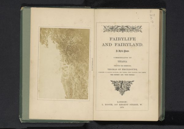
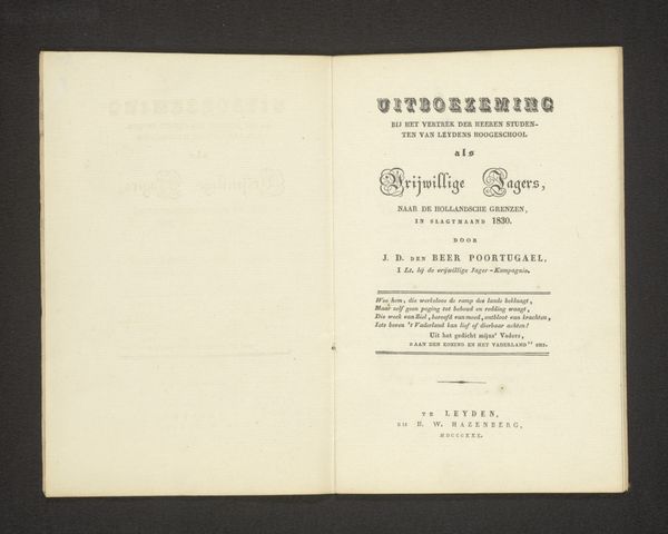
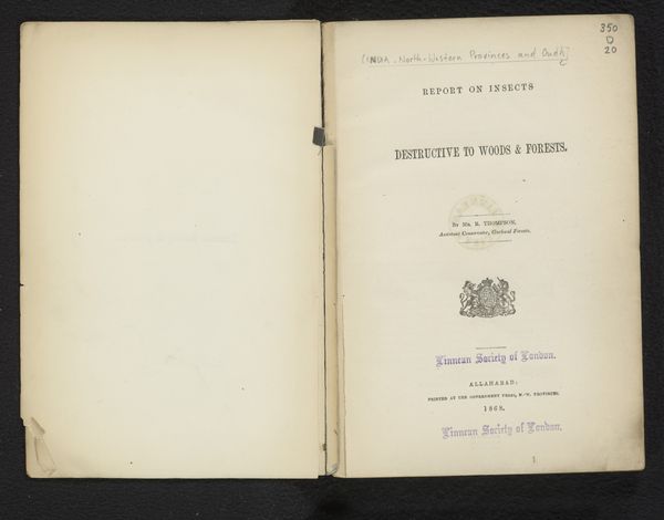
Dimensions: height 23 cm, width 13.7 cm
Copyright: Rijks Museum: Open Domain
Diederik Jacobus den Beer Poortugael created this book titled ‘Hollands Leeuw in 1830 en 1831’ around 1831. The work presents us with a study in contrasts and balance, characteristic of the era's structured approach to knowledge and presentation. The open book format divides the composition into two distinct yet related fields. The right page, dominated by text, uses typography as a structural element, with varying font sizes creating a visual hierarchy that guides the reader's eye. The left page offers a stark contrast with its relative emptiness, save for a faint, ghosted impression of the printed content. This juxtaposition invites a semiotic reading, where the text represents official discourse, and the blank page symbolizes the unwritten, the potential, or perhaps the suppressed voices of the time. The materiality of the paper, its texture and aging, adds another layer. These physical qualities ground the intellectual content in a specific historical context. It’s a reminder that knowledge is not abstract but is always embedded in material reality. The book challenges us to think about how meaning is constructed through formal elements, inviting an ongoing interpretation of history and discourse.
Comments
No comments
Be the first to comment and join the conversation on the ultimate creative platform.
More like this