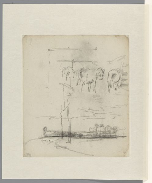
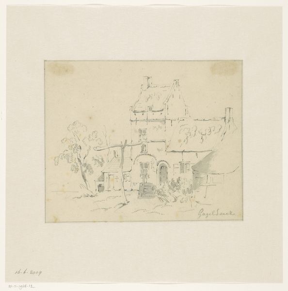
drawing, mixed-media, print, ink
#
drawing
#
mixed-media
# print
#
furniture
#
etching
#
ink
Dimensions: sheet (irregular): 13 9/16 x 13 3/4 in. (34.4 x 34.9 cm)
Copyright: Public Domain
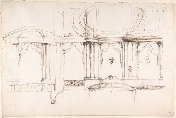
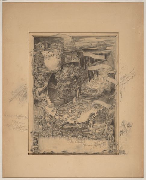
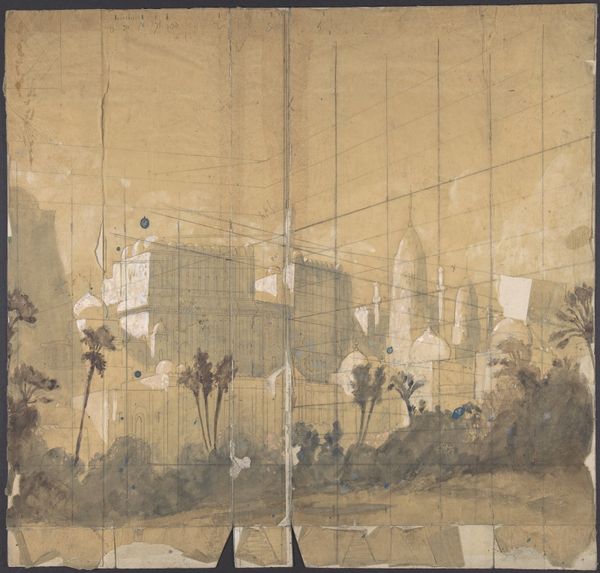
Curator: This is an intriguing 19th-century mixed-media drawing currently held at the Metropolitan Museum of Art, known as "Furniture Designs," made with ink, etching, and other media by an anonymous hand. Editor: My immediate reaction is one of staged opulence, but drained of color and life. It's like looking at the ghost of grandeur. Curator: An apt description. What we're seeing here speaks volumes about the changing societal landscape and the role of design within it. The piece reveals much about 19th-century aspirations. The arrangement emphasizes social interaction but within a very controlled, almost theatrical setting. What symbols resonate with you here? Editor: The starkness, for one. While the furniture design itself aims at lavishness with its multiple tiers and ornate detailing, the limited color palette almost seems to undermine the aspiration for grandeur. Perhaps that starkness suggests the potential futility or fleeting nature of such elaborate displays of wealth? Curator: An interesting take, linking impermanence with material ambition. My focus drifts to the symbolic intent – consider the staged arrangement, suggestive of performances. This invites considering how public perception, display and ritual were integral to social identity during this era. Think about the psychology of "keeping up appearances". Editor: I also wonder about accessibility, or rather the lack thereof. The design suggests that interaction is more about being observed than genuine connection. How does the history of furniture design reflect socio-political dynamics? Curator: The materials chosen speak of status and permanence, attempting to convey solidity but failing to fully convince due to the rendering’s inherent impermanence on paper. These designs would translate differently in oak and velvet; perhaps this in-between stage highlights the performative aspect all the more. The intent to impress, made transparent through the fragility of representation. Editor: It’s interesting how a piece intending to depict comfort ends up feeling so unsettling, almost satirical in its commentary on wealth and display. Curator: It reveals the complicated interplay of symbols, technique, and emotional resonance. Editor: Leaving us contemplating the layers beneath opulent surfaces.
Comments
No comments
Be the first to comment and join the conversation on the ultimate creative platform.
More like this