drawing, print, etching
#
drawing
#
hand written
#
hand-lettering
# print
#
etching
#
hand drawn type
#
landscape
#
hand lettering
#
personal sketchbook
#
hand-written
#
hand-drawn typeface
#
fading type
#
geometric
#
history-painting
#
small lettering
#
initial sketch
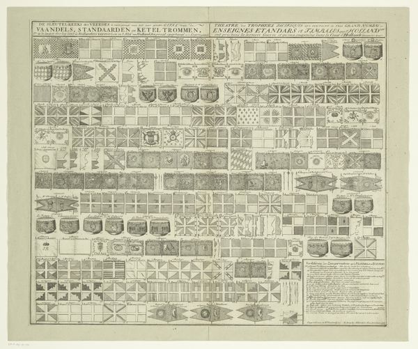
Dimensions: height 292 mm, width 445 mm
Copyright: Rijks Museum: Open Domain
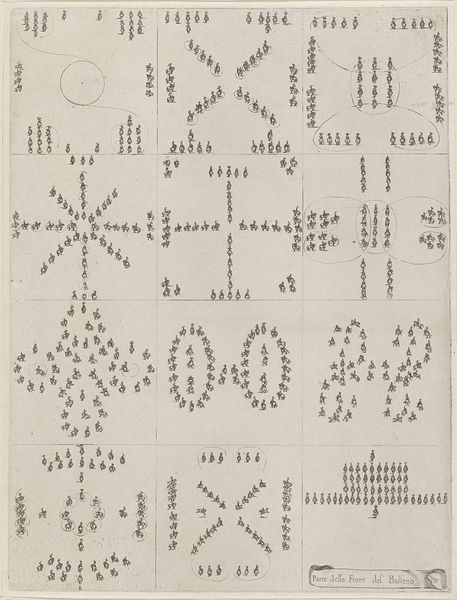
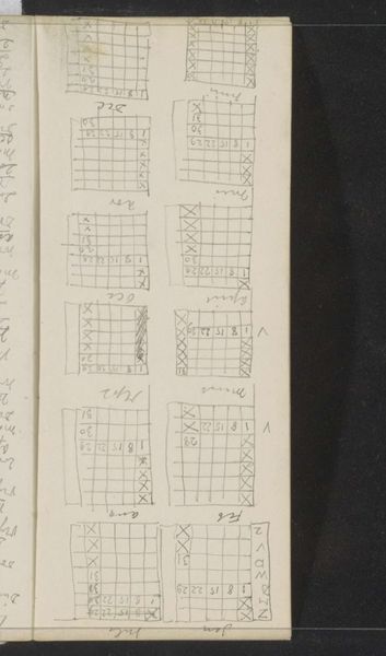
Editor: So this is Stefano della Bella's "Paardenballet", created sometime between 1620 and 1664. It's an etching and drawing now held at the Rijksmuseum. It's really intriguing to see this dance of forms mapped out; the layout and precision remind me of a blueprint, though for something quite whimsical. What do you see in this piece? Curator: I note first the gridded composition—a matrix, if you will, of discrete spatial arrangements. Della Bella here is not simply depicting but dissecting the performative event. The horse ballet exists less as a spectacle and more as a series of diagrammatic episodes, consider the variation in shape in the groupings of horses: note their relation to each other; also notice that each quadrant functions independently, and what impact that may have on one's reading. Editor: That makes a lot of sense. I was drawn in by the layout but hadn't quite considered each square individually and its relationship to the whole, like dance stills. Curator: Precisely. Consider the role of line here. Della Bella masterfully uses etching to render the complex choreography with an austere elegance. Note the lines' variable thicknesses and textures. Editor: And the central text serves almost like a legend, guiding us through the depicted forms, almost a dance notation… Were these layouts common then? Curator: It's an astute observation. Layouts such as this reveal period notions around control, ordering of events, almost anticipating photography's capturing and indexing capacities, despite not possessing any form of indexicality. Do you think a more fluid composition might have suited the theme better? Editor: That's a fascinating question. Perhaps fluidity would have obscured the mechanics of the ballet, while the gridded design places emphasis on the geometry of it all. This structured layout grants clarity, inviting methodical deconstruction of each horse movement. I will need to ponder your query. Curator: Indeed, consider then the formal qualities – the line, the space, the grid itself – as conveyors of meaning beyond mere representation.
Comments
No comments
Be the first to comment and join the conversation on the ultimate creative platform.
More like this