drawing, paper, watercolor
#
17_20th-century
#
drawing
#
abstract painting
#
landscape
#
german-expressionism
#
paper
#
watercolor
#
german
#
expressionism
#
watercolor
#
monochrome
Copyright: Public Domain
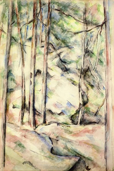
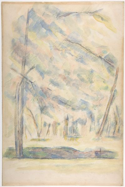
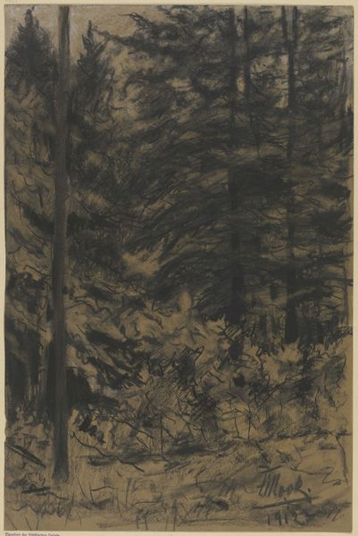
Editor: This watercolor on paper, "Bare Conifers" by Christian Rohlfs, painted in 1921, feels surprisingly modern. The texture created by the watercolor is quite captivating. What's your perspective on this piece? Curator: Let's consider the paper itself, a mass-produced item in 1921. Rohlfs chose it deliberately. Watercolor, often deemed less significant than oils, becomes a crucial element here. It speaks to a shift in artistic values, away from traditionally "precious" materials and toward a focus on the act of creation itself, and its accessibility. Notice the monochrome palette; what impact does it have on the drawing? Editor: I suppose that by limiting his colour palette, he is almost showcasing the process of applying colour wash; he makes no attempt to create a fully realistic forest and in fact emphasizes the materials that make up the piece. Curator: Exactly. And consider Rohlfs' context: Germany in 1921, still reeling from World War I. There's a raw, almost brutal honesty in this depiction. The conifer, a hardy survivor, becomes a symbol. This wasn’t pristine nature; this was a landscape impacted, viewed through the lens of hardship. Editor: So the material choices and the stark landscape reflect a wider societal experience of the time. Curator: Precisely. How might mass-produced paper, used to depict damaged nature, comment on industrialization and its consequences? The art resides not just in the image, but in the conversation between materials, maker, and the world around him. Editor: That makes me appreciate the piece much more. I was so focused on the composition that I hadn't really thought about what the choice of materials and subject could be saying about the state of Germany at the time. Curator: It’s a potent reminder to examine the physical and social circumstances behind every work of art.
Comments
stadelmuseum over 2 years ago
⋮
A vivid blue dominates the composition. It is the sky, crisscrossed with low clouds and bare conifer trunks. Rohlfs applied it with dynamic brushwork: layers of wide, intersecting strokes create a rhythmic web. He also introduced streaks of light by removing the blue in places, and integrated the earthy hues of the vegetation. The impression of nature thus becomes a colour composition. The water temperas he used almost exclusively from 1920/21 onwards enhance the subtle plays of colour and light.
Join the conversation
Join millions of artists and users on Artera today and experience the ultimate creative platform.
More like this