#
cubism
# print
#
pop art
#
figuration
#
geometric
#
modernism
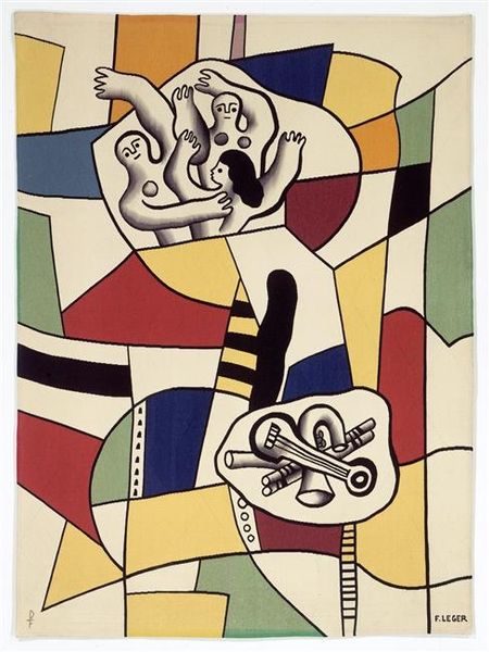
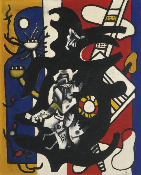
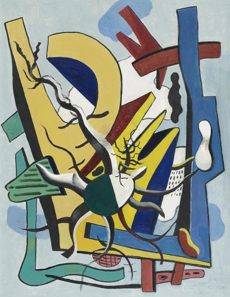
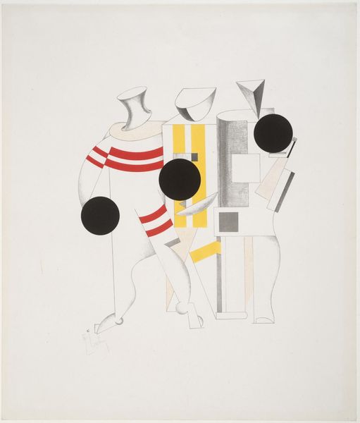
Copyright: Fernand Leger,Fair Use
Fernand Léger made this print, "Circus," with lithography, a process that embraces the accidental, the smudges and the overlaps that make it so human. Léger's colours here are so bright, like someone turned up the saturation dial all the way! Look at how the forms seem to float and intersect. The black lines that describe each shape feel almost like outlines in a coloring book, but the colours don't always stay inside the lines. See the way his figures are built from cylinders and cones? Léger reduces the body to simple geometric forms. It’s like he's saying, "Hey, we're all just shapes bumping into each other!" Thinking about predecessors, Léger's simplification of form definitely owes something to Cubism, but unlike the muted tones of Picasso or Braque, he cranks up the volume with these bold primary colours. And what about those intersecting lines? They suggest the dynamic energy of Italian Futurism. Ultimately, this is all just my reading, maybe you see something else. The circus is whatever you want it to be, right?
Comments
No comments
Be the first to comment and join the conversation on the ultimate creative platform.
More like this