Copyright: Public Domain: Artvee
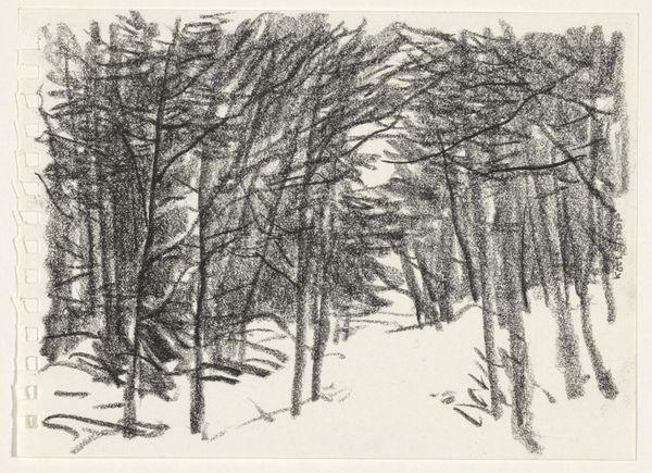
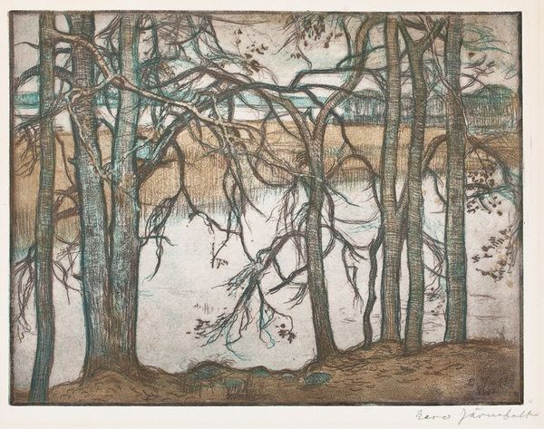
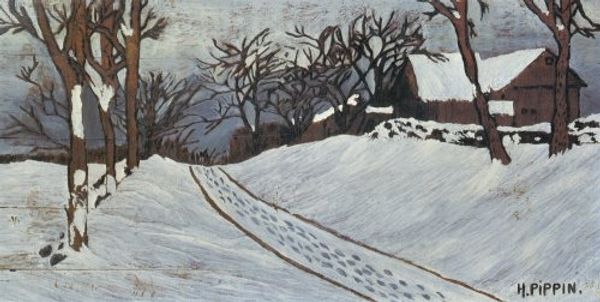
Curator: Before us is Eero Järnefelt’s “Trees in Winter,” created in 1915 using colored pencils. Editor: A very delicate thing, isn’t it? Like a memory fading at the edges. The paper itself has an almost textile-like quality, drawing me right in, against the desolation it tries to convey. Curator: Absolutely, the texture is quite captivating for what we often relegate to just "drawing." I think it hints at the broader artistic debates of the time. Järnefelt was working in a period when the lines between fine art and craft were actively being questioned, even blurred. Think about it: what does it mean to painstakingly create this scene with, essentially, fancy crayons? Is that “lesser” somehow than oil on canvas? Editor: Precisely! And looking closer at these specific materials: What sort of colored pencils were available in 1915 Finland? Were they mass-produced, or handcrafted somehow? The piece prompts so many questions about its making. Also, I can’t help but notice the symbolism tucked inside, almost an anthropomorphic quality given to those central trees; the way their branches meet at the top...almost heart-shaped! Curator: Yes, I do believe it flirts a bit with symbolism, nudging beyond mere landscape representation toward a more emotive experience, of harsh conditions perhaps endured, maybe love! And look at the layers of colour Järnefelt coaxes out of those pencils – that luminous blue in the background sky contrasted against the browns and blacks. The color evokes a sense of calm and frozen wonder! Editor: And those shadow marks scratched on the snow with colored pencils – an excellent representation of the frigid breeze rippling over that surface! It's quite visceral, in the best way, almost making my skin crawl. Järnefelt used a very basic, even pedestrian medium, to conjure some powerful responses, for sure. Curator: Agreed! The image rewards slow, deliberate observation. Even in its muted palette, there’s a silent vibrancy, the winter scene coming alive by the layering of color over form. Editor: So it invites contemplation...both of what is represented, of the how of it's represented. So, well-worth the second look then, that it demands.
Comments
No comments
Be the first to comment and join the conversation on the ultimate creative platform.
More like this