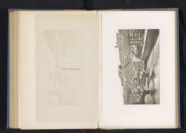
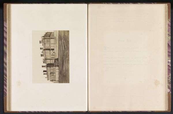
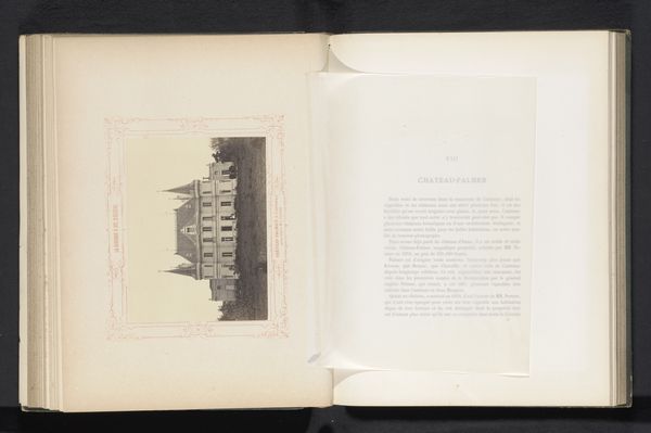
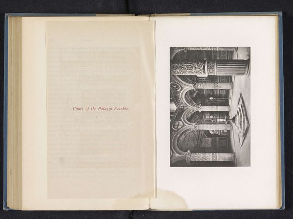
lithograph, print, engraving, architecture
#
lithograph
# print
#
cityscape
#
italian-renaissance
#
engraving
#
architecture
#
building
Dimensions: height 87 mm, width 130 mm
Copyright: Rijks Museum: Open Domain
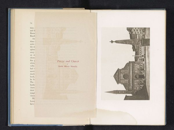
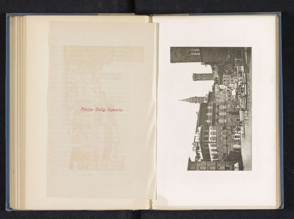
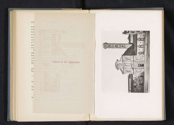
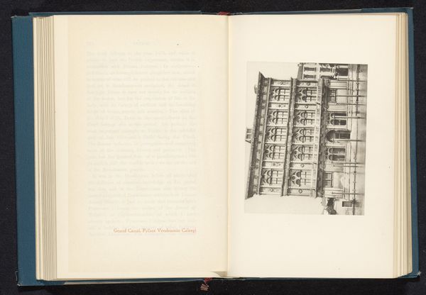
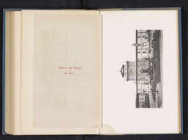
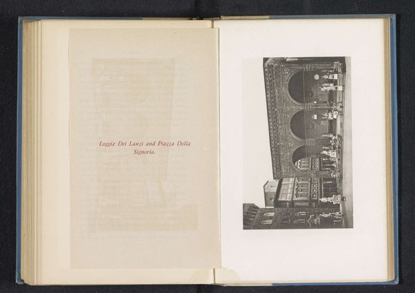
Editor: This print, "Voorgevel van Santa Croce te Florence," or "Facade of Santa Croce in Florence," is an engraving or lithograph from before 1890. It depicts the facade of the Basilica di Santa Croce. It feels very architectural, like a blueprint almost, and a little bit sterile in its precision. What stands out to you in this piece? Curator: I'm struck by the visual choices that position this famous landmark for consumption within a broader political and social context. Santa Croce wasn't merely a religious building; it was conceived to compete with the Dominican church of Santa Maria Novella, expressing a Franciscan presence in the city. Think about what it meant to choose *this* building. Who does it speak to and who does it exclude? Editor: I see your point. So, you’re saying the selection of subject matter is inherently political. But why reproduce it in this medium? What does a print add to our understanding of Santa Croce? Curator: Exactly. The print medium itself speaks to a democratization of art, an accessibility previously reserved for the elite. These images circulated widely, shaping perceptions of Italian identity and heritage. Notice, though, how devoid it is of people. Why highlight the architecture while erasing the vibrant communities it housed and served? Editor: That’s a perspective I hadn’t considered before. I guess I was looking at it more from a formal perspective, but it makes sense to think about whose stories are being told, and whose aren't. Curator: The built environment always carries embedded ideologies. This print prompts us to think about whose voices echo within those walls and whose are silenced in the making of national narratives. Editor: I will certainly never look at architectural prints the same way again!
Comments
No comments
Be the first to comment and join the conversation on the ultimate creative platform.
More like this