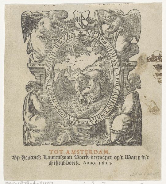
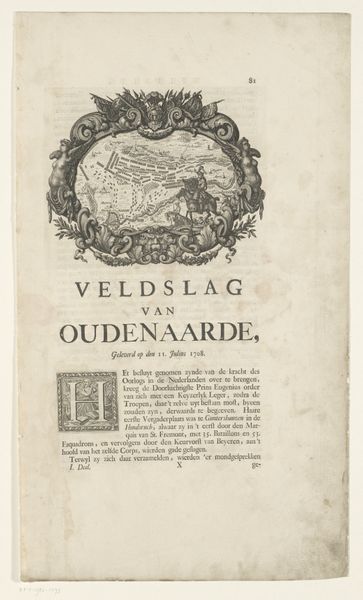
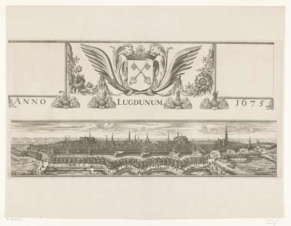
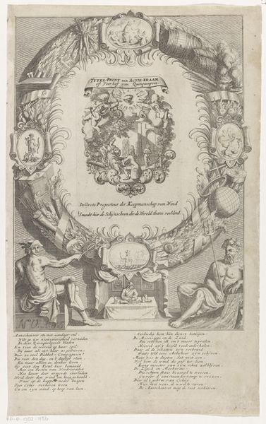
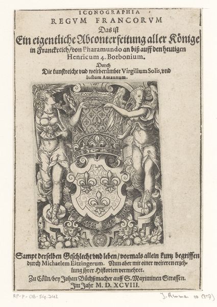
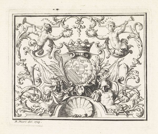
print, engraving
#
allegory
#
baroque
# print
#
landscape
#
line
#
cityscape
#
history-painting
#
decorative-art
#
engraving
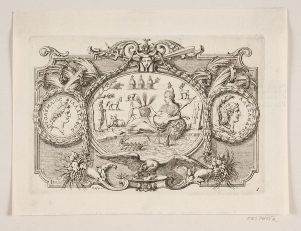
Dimensions: height 444 mm, width 580 mm
Copyright: Rijks Museum: Open Domain
Editor: Here we have Coenraet Decker’s "Kaart van Kennemerland en West-Friesland," made around 1680. It’s an engraved print, but it's more than just a map, it feels like an elaborate stage design with figures and ornaments. What jumps out at you about the structure of this print? Curator: The first element that grabs my attention is the clear delineation of space. Notice how Decker segments the composition, employing an assertive contrast between the functional cartography and the allegorical adornments. Consider the implications of the spatial arrangement. Editor: You're right; it’s segmented in a very distinct way. I see how the cartography seems almost secondary to the theatrics around it. How do these decorative elements function, structurally? Curator: Note the density of detail. Observe the contrast between the controlled lines of the map itself, and the florid, almost excessive ornamentation. These are deliberately juxtaposed to create visual tension. The linear precision serves a purely informative purpose while the other acts purely decorative; note that by today's aesthetic standards they would create imbalance and disharmony, were it not for Decker's mature sensibility and skill. What feeling does this cause? Editor: It is interesting to note the tension you described - while the linear elements work well on their own to produce a traditional style of cartography, I would not typically associate a highly decorated design to something intending to illustrate direction or provide information about geographic borders. Decker may have done well in that era to incorporate decorative features and allegory with cartography, though to me it feels counter-intuitive from today's standard. Thanks for pointing out the linear qualities and contrast! Curator: Precisely. The disjunction prompts a deeper reflection on how art conveys purpose and navigates our sensibilities. Through such discordance, visual tension can heighten aesthetic perception, no? Editor: That’s definitely something I’ll consider more when I look at prints from this period. Thank you!
Comments
No comments
Be the first to comment and join the conversation on the ultimate creative platform.
More like this