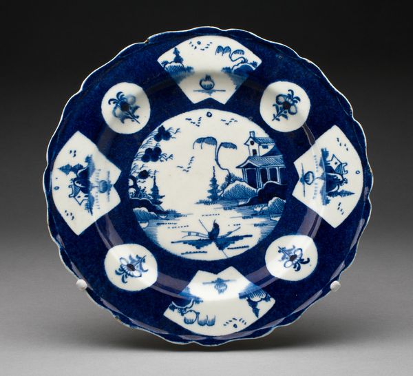
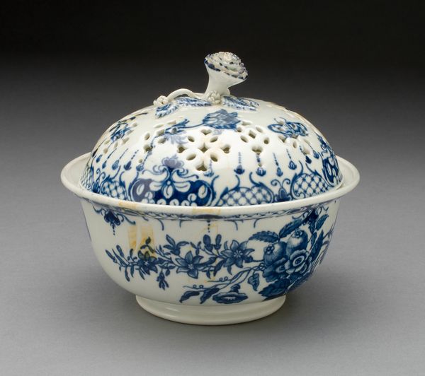
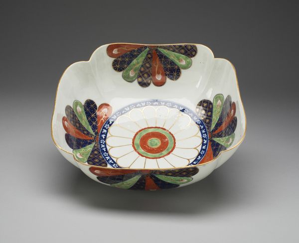
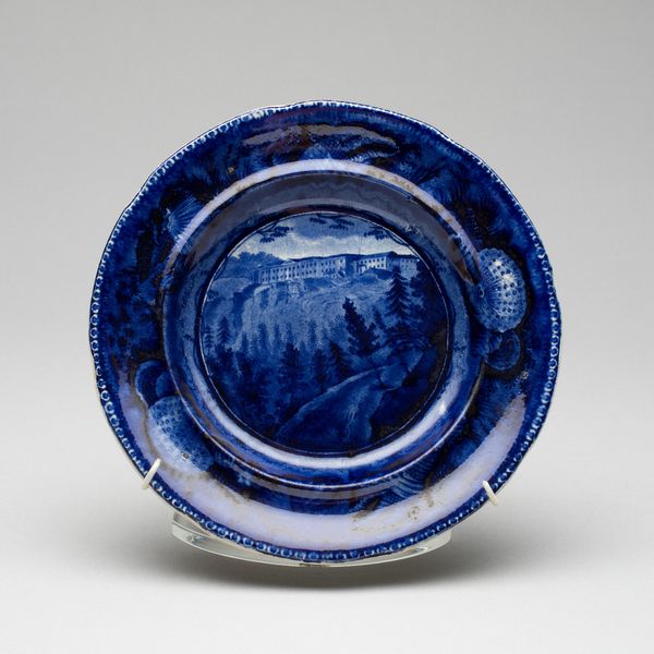
print, ceramic, porcelain
landscape
ceramic
jewelry design
porcelain
orientalism
ceramic
decorative-art
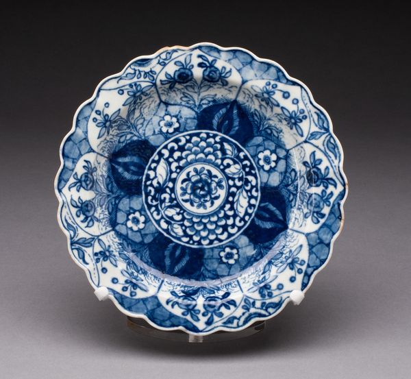
Dimensions: Diam. 20.5 cm (8 1/16 in.)
Copyright: Public Domain
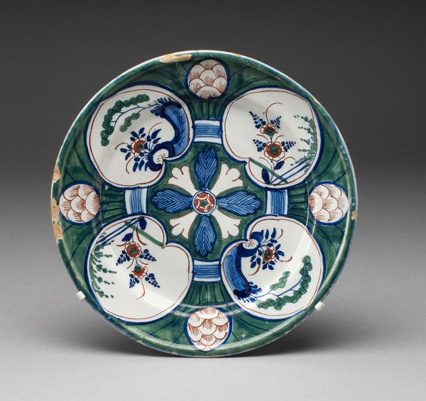
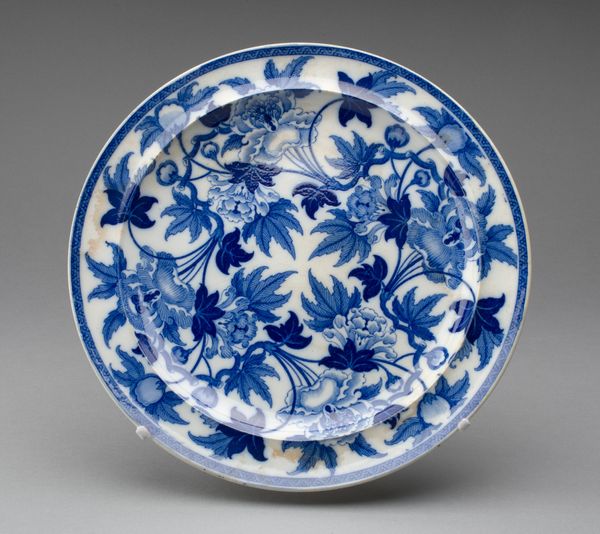
Curator: This porcelain Dish was created by the Worcester Royal Porcelain Company around 1770. Notice the deep cobalt blue and white palette. Editor: Immediately, it strikes me as serene and well-balanced, despite the almost kaleidoscopic design. The cool blue imbues it with a certain formality. Curator: Indeed. The arrangement of the design elements creates a deliberate structure. We have landscape scenes rendered in these segmented, fan-like shapes, alternating with small roundels, all set against this textured blue ground. The shapes—circular, triangular—work to establish visual harmony across the entire surface. Editor: Those fan shapes are clearly referencing traditional East Asian art. I sense a yearning for the exotic here, typical of the 18th-century Orientalism craze in European decorative arts. These scenes aren't necessarily accurate depictions but convey a mood and idealized vision of Eastern life. Curator: Note how the artist uses negative space—the stark white—to define forms. The composition emphasizes contrast, creating sharp delineation that is inherently satisfying to the eye. Each section presents an alternate view to create dynamism, held by a consistent symmetry in color and form. Editor: In each section, the scenes offer glimpses into what Westerners at the time might have romanticized as Eastern leisure. Fishing, idyllic gardens, distant mountains… it feeds into the exotic allure, playing with the viewer's imagination and perhaps their aspiration to have seen or own a piece of that distant culture. Curator: Yes, it embodies a dialogue between the medium—porcelain—and the image printed upon it, which creates a multi-layered complexity. And the wavy edge is interesting in the ways that the lines disrupt and soften the visual planes of the disk. Editor: Ultimately, this Dish invites us to contemplate cultural exchange and perception, subtly hinting at the complicated relationships of trade, knowledge, and artistic expression prevalent in that era. What seems pretty, in fact, is born of historical circumstances far from straightforward. Curator: An astute observation. Considering the design elements in relation with its period adds yet another valuable strata for our engagement. Editor: Exactly. An object of simple elegance that asks for nuanced contextualisation.
Comments
No comments
Be the first to comment and join the conversation on the ultimate creative platform.