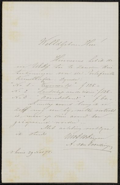
Brief aan de heer Verloren van Themaat, secretaris van Genootschap Kunstliefde Possibly 1877
0:00
0:00
drawing, paper, ink, pen
#
drawing
#
hand written
#
hand-lettering
#
ink paper printed
#
hand drawn type
#
hand lettering
#
paper
#
personal sketchbook
#
ink
#
hand-drawn typeface
#
pen work
#
sketchbook drawing
#
pen
#
sketchbook art
#
calligraphy
Copyright: Rijks Museum: Open Domain
Editor: Today we're looking at "Brief aan de heer Verloren van Themaat, secretaris van Genootschap Kunstliefde," possibly from 1877, by Hendrik Veder. It’s ink on paper, a handwritten letter. It strikes me as incredibly delicate, with the cursive script creating intricate patterns across the page. What do you see in this piece? Curator: What immediately draws my attention is the calligraphic quality. Consider the line weight, the consistent slant, and the elegant flourishes. The forms of the letters themselves create a visual texture, a structured composition. Even without understanding the language, the arrangement of the script presents an aesthetic experience. What compositional elements do you observe? Editor: Well, the density of the ink varies, creating a sense of light and shadow across the page. Also, the handwriting slants gently upwards, adding a sense of movement and optimism. Do you think that was intentional? Curator: Intention is always difficult to ascertain. However, one can analyze the visual effect. The upward slant can be interpreted as dynamism, aspiration. Furthermore, examine how the negative space between the lines and words shapes the overall form. The white of the paper is as important as the ink itself in creating visual balance. Do you notice how the layout on the page contributes to its artistic quality? Editor: I hadn't considered that, but you’re right. The way the text is arranged within the borders of the paper creates a sense of contained energy. It makes the whole letter feel like a carefully constructed artwork, not just a piece of correspondence. Curator: Precisely. And through analyzing the composition, line quality, and use of space, we begin to appreciate the artwork beyond its mere function. What have you learned? Editor: To look past the content, and to appreciate the artistic choices made even in something as simple as a handwritten letter. Thanks!
Comments
No comments
Be the first to comment and join the conversation on the ultimate creative platform.
More like this