drawing, graphic-art, print, ink, engraving
#
drawing
#
graphic-art
#
art-nouveau
#
ink drawing
# print
#
pen illustration
#
ink
#
geometric
#
line
#
decorative-art
#
engraving
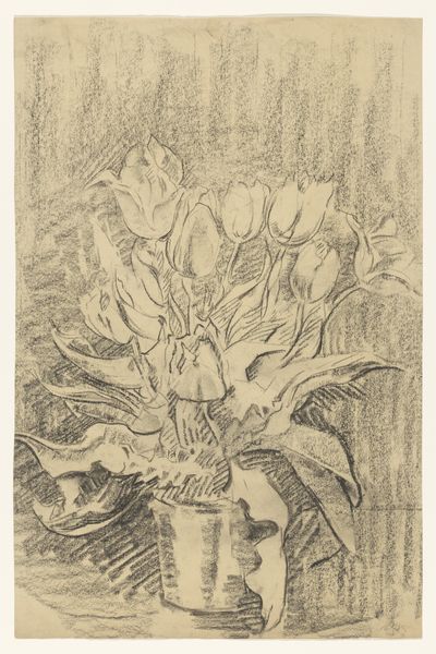
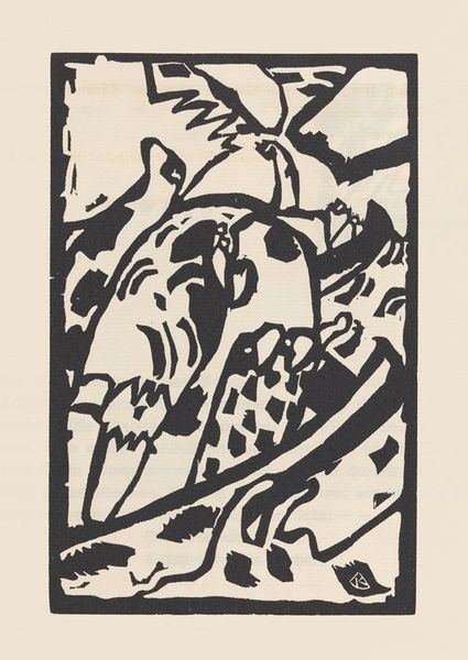
Dimensions: height 179 mm, width 118 mm, width 236 mm
Copyright: Rijks Museum: Open Domain
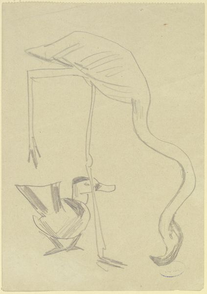
Curator: Here we have Barbara Elisabeth van Houten’s "Menukaart met tulpen", a menu card with tulips, crafted before 1902. What strikes you first about this particular piece? Editor: The starkness, undeniably. The linework is so assertive; the image feels like an elegant botanical skeleton rendered in ink. There’s an almost graphic quality, something undeniably modern despite its age. Curator: Indeed. The image exemplifies the characteristics of Art Nouveau through its sinuous lines and emphasis on decorative elements derived from nature. What significance do you see in a menu being treated with such artistry? Editor: Menus serve as documents of consumption, reflecting both economic status and cultural trends. A decorated menu elevates the dining experience into a cultivated affair. By associating tulips with a curated dining event, van Houten invites a kind of ephemeral art into the daily rituals of the wealthy. Curator: Fascinating. Van Houten's rendering showcases tulips which are deliberately stylized. The stems and leaves become architectural lines supporting the voluminous floral heads, their reproductive potential becoming muted. How does this formal choice communicate broader themes? Editor: Through stark contrasts and a limited palette, she distills the flower's essence, transforming botanical representation into nearly abstract design. I also see how the looping inscription reinforces this stylization; both word and image embrace the curvilinear elegance emblematic of Art Nouveau. This print isn’t merely depicting tulips, it is investigating ways we organize perception using symbolic, organic forms. Curator: That is beautifully said. The placement of lettering within and around the tulips suggests a deep awareness of textual and pictorial interplay. Her decorative elements merge with functional text seamlessly. I suppose the context helps appreciate her innovation. Editor: Yes, it’s a compelling insight into the aesthetic values governing daily life at the turn of the century, an artifact from when taste was as crucial to bourgeois society as money itself.
Comments
No comments
Be the first to comment and join the conversation on the ultimate creative platform.
More like this