print, metal, relief, engraving
portrait
metal
relief
ancient-mediterranean
engraving
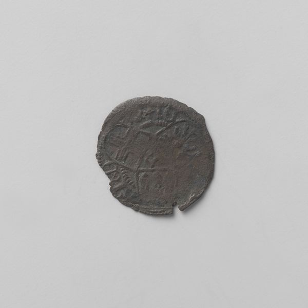
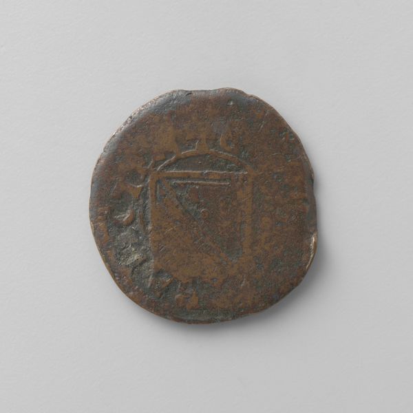
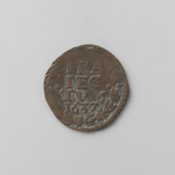
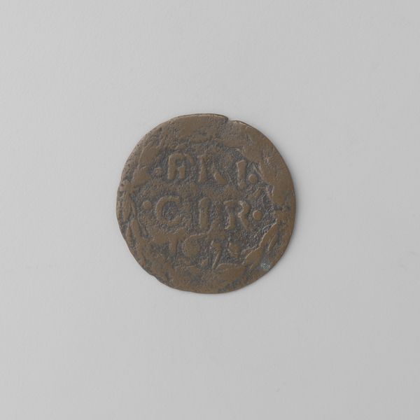
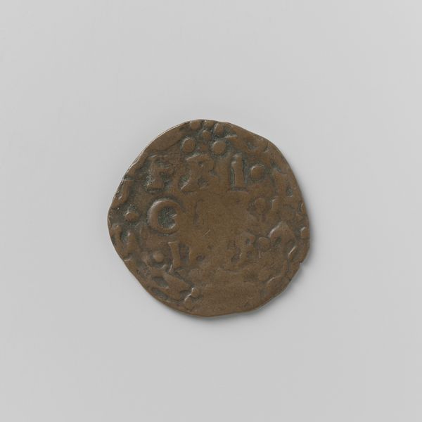
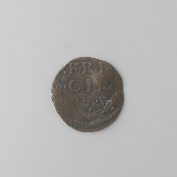
Dimensions: diameter 2.2 cm, weight 3.8 gr
Copyright: Rijks Museum: Open Domain
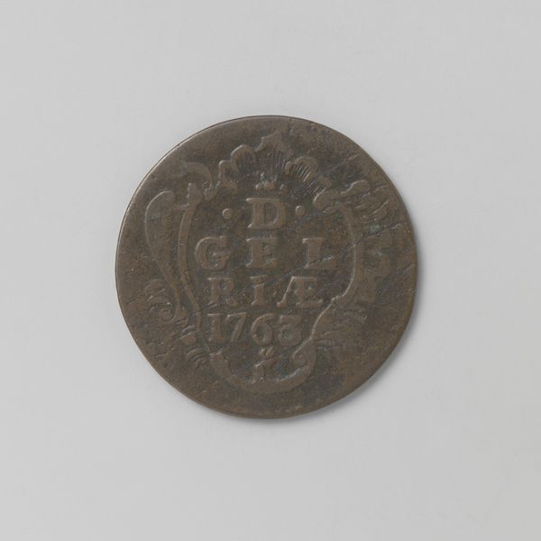
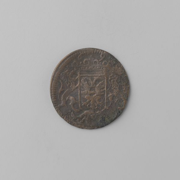
Editor: Here we have a Gelderse duit from 1767. It's so small! The texture of the metal and the raised design gives it an interesting tactile quality. What strikes you about the visual composition? Curator: Observe how the circular format dictates the internal composition. The central inscription, crowned above, asserts dominance through hierarchy of form, while peripheral elements function as framing devices, guiding the eye inwards. How does this structured arrangement influence our perception? Editor: It makes the lettering very prominent, almost like it’s declaring something important. I’m drawn to deciphering it. What is the relief itself trying to convey? Curator: Consider the contrast between the smooth, undecorated surface surrounding the intricate relief. This contrast heightens the viewer's focus, creating a dialogue between positive and negative space. The raised elements project meaning through shadow and light, activating the surface. Editor: So the design itself and the use of empty space are both equally important parts of the artistic expression here. It’s not just about what is there, but also about what isn’t. Curator: Precisely. The deliberate choice of form and arrangement invites us to decode the object beyond its immediate function. What semiotic relationships can be identified in this seemingly simple coin? Editor: I see that even something as functional as a coin uses sophisticated design principles to communicate power and value. I'll never look at pocket change the same way again. Curator: Indeed. The rigorous application of formal elements transforms a commonplace object into a fascinating subject of art historical inquiry.
Comments
No comments
Be the first to comment and join the conversation on the ultimate creative platform.