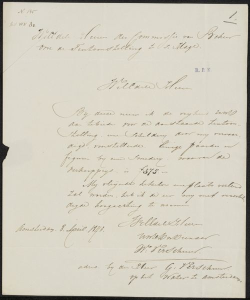
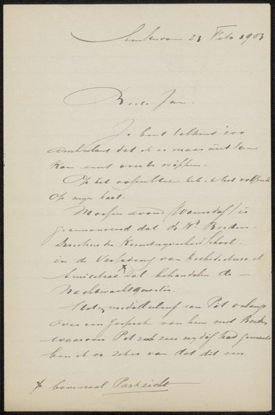
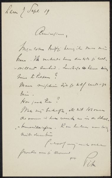
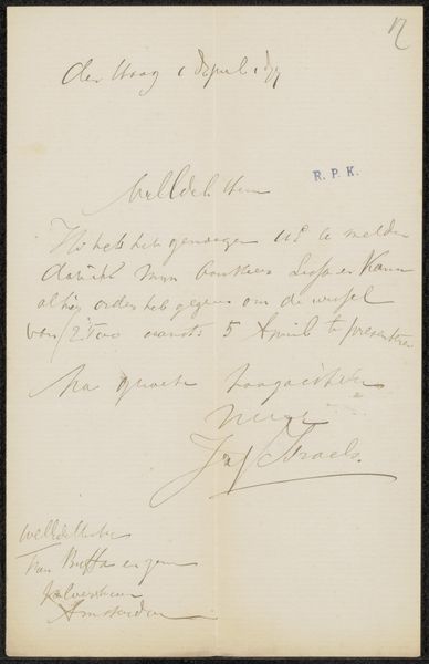
drawing, paper, ink
#
drawing
#
paper
#
ink
#
calligraphy
Copyright: Rijks Museum: Open Domain
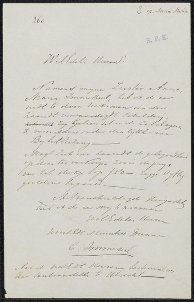
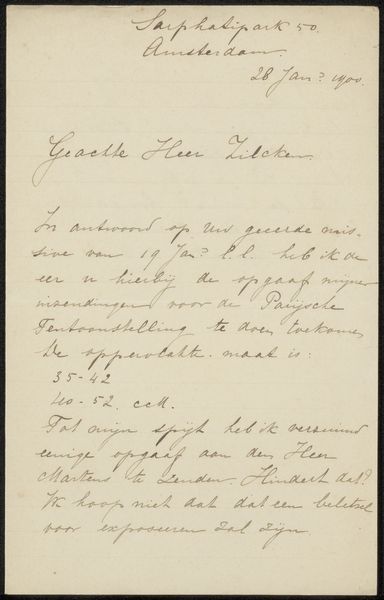
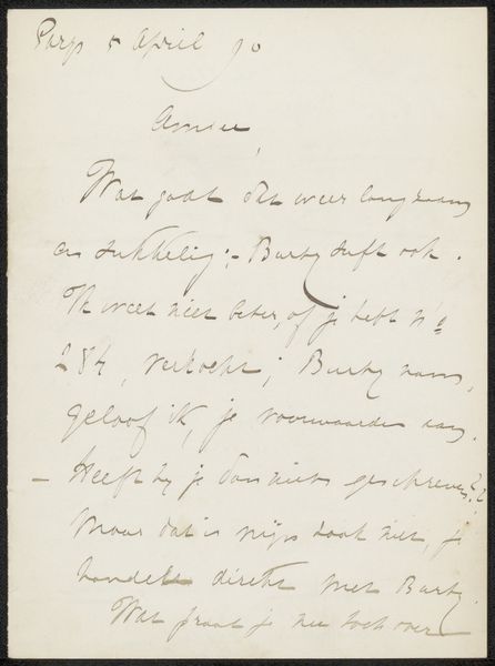
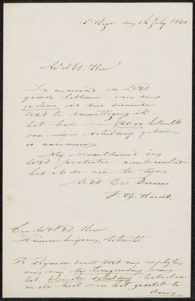
Editor: We’re looking at "Brief aan Frans Buffa en Zonen," which translates to "Letter to Frans Buffa and Sons." It’s potentially from 1875, by Theo Mesker, created with ink on paper. It's at the Rijksmuseum. I find the elegant script quite striking, it gives off a very formal and organized feel. How does this piece strike you? Curator: Well, consider that in 1875, the rise of industrialization influenced how people viewed artistry. Calligraphy, like this, became a conscious choice, pushing back against mass production. Note the letter’s existence, itself. Who was Frans Buffa and Sons? They were an art dealership in Amsterdam. Editor: Oh, so this letter is a business correspondence. Curator: Precisely. The "high art" world depended on these businesses, demonstrating the crucial intersection of artistic creation and its market. And a letter—an object with its own intended receiver—takes on a public existence as it is displayed in the museum. What choices does the institution face in exhibiting this kind of work? Editor: It’s interesting to think about the museum displaying a private correspondence. Displaying the work could speak to themes of accessibility in art, the influence and innerworkings of the art world. But the letter could also feel taken out of context. Curator: Exactly! Presenting an artwork inevitably raises complex questions about cultural value, historical narrative, and even privacy. Editor: I never considered that. So much more to a letter than just its text! Curator: Indeed. Every exhibit tells a story - but whose story is being told, and how?
Comments
No comments
Be the first to comment and join the conversation on the ultimate creative platform.
More like this