Dimensions: 237 × 160 mm (image/plate); 435 × 347 mm (sheet)
Copyright: Public Domain
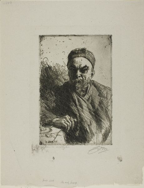
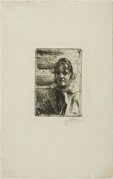
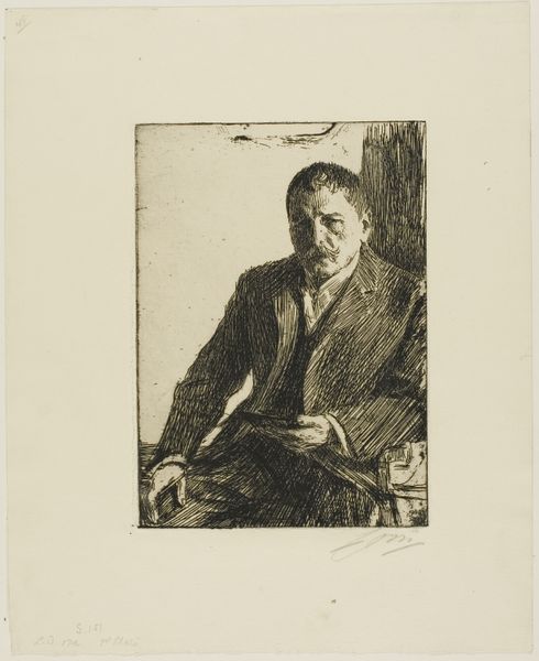
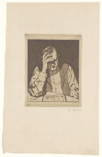
Editor: This is Anders Zorn’s "Paul Verlaine II," an etching from 1895. I find the lines so intense; they really convey a sense of brooding. What's your perspective on this piece? Curator: Formally, observe how Zorn uses the etching technique to create depth and texture. Notice the strategic deployment of chiaroscuro—the stark contrast between light and shadow. How does this contrast contribute to the overall composition? Editor: It seems to accentuate Verlaine's features, particularly around the eyes, which does amplify that feeling of intensity. Curator: Precisely. Now, consider the orientation of the lines themselves. The diagonal strokes, especially in the background, generate a sense of movement and instability. Do you perceive a disruption in the compositional balance? Editor: Yes, now that you mention it, the background lines almost clash with the relative stillness of the subject's face. It's like a visual tension. Curator: Indeed. This visual tension is critical. The subject is positioned firmly; the expression seems fixed. However, the surrounding lines and varying depths undermine any expectation of complete stasis. What does this tell you? Editor: I hadn't considered that. It suggests an internal conflict, perhaps? The subject appears composed but is set against a flurry of visual instability, which provides so much context and insight. Thank you for helping me understand Zorn's use of line. Curator: The close analysis of visual elements can reveal new perspectives. Consider how line and composition create meaning.
Comments
No comments
Be the first to comment and join the conversation on the ultimate creative platform.