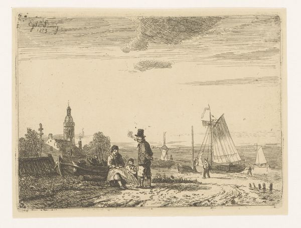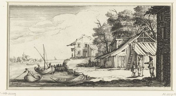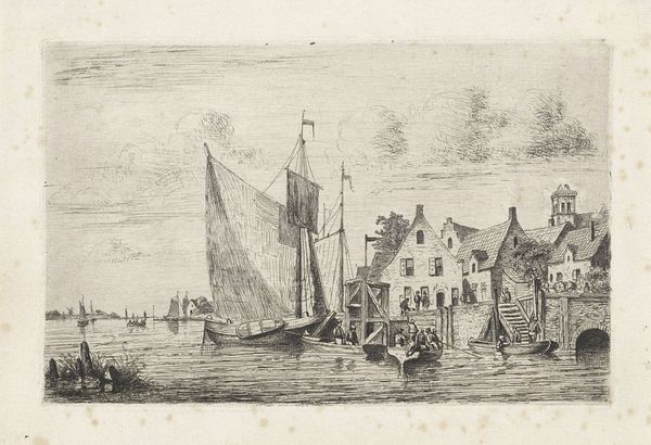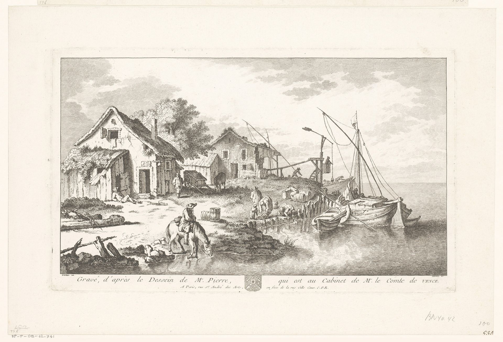
1715 - 1763
Landschap met twee huizen en bedrijvigheid aan een kade
Quentin Pierre Chedel
1705 - 1763Location
RijksmuseumListen to curator's interpretation
Curatorial notes
Curator: Quentin Pierre Chedel's "Landschap met twee huizen en bedrijvigheid aan een kade," created sometime between 1715 and 1763, offers a fascinating glimpse into 18th-century Dutch life. The artwork, housed at the Rijksmuseum, is an engraving that details a bustling waterside scene. Editor: Immediately striking is the light and shade contrast – quite dynamic for an engraving. There’s a softness too, an atmospheric quality despite the precision of the lines. Curator: This etching offers us a tangible connection to the everyday realities of the period. Look at the labor taking place by the docks – the loading and unloading of goods, likely crucial for the local economy. Notice how the architectural style of the two houses reflects practical considerations of materials and craftsmanship, speaking volumes about available resources. Editor: Structurally, I'm intrigued by how the composition directs the viewer's gaze from the darkened foreground, featuring a man on horseback, back toward the detailed activity at the wharf, finally resolving in the expansive, lighter tones of the water and sky. The repetition of vertical lines in the rigging of the ships creates a visual rhythm that's quite engaging. Curator: And consider the consumption patterns embedded in the imagery. This type of genre scene provided an aestheticized view of labour for wealthy patrons who very likely acquired such images, solidifying class boundaries via depiction. It’s more than just a pretty picture; it is a document revealing much about the organization of labor in Dutch society during that period. Editor: Certainly, one could see that. The figures working have become picturesque, integrated within this balanced and beautiful schema of line and form. Yet, do the signs of labor overshadow an appeal to visual harmony and balance characteristic of its time? Or does it successfully blend social commentary within an accessible and beautiful whole? Curator: Perhaps, therein lies its complexity – art and labor, intertwined in production and interpretation. Editor: Indeed. I’ve enjoyed how its formal qualities opened up discussion about its cultural implications, grounding abstract concepts of line and light with evidence of work and manufacture.