About this artwork
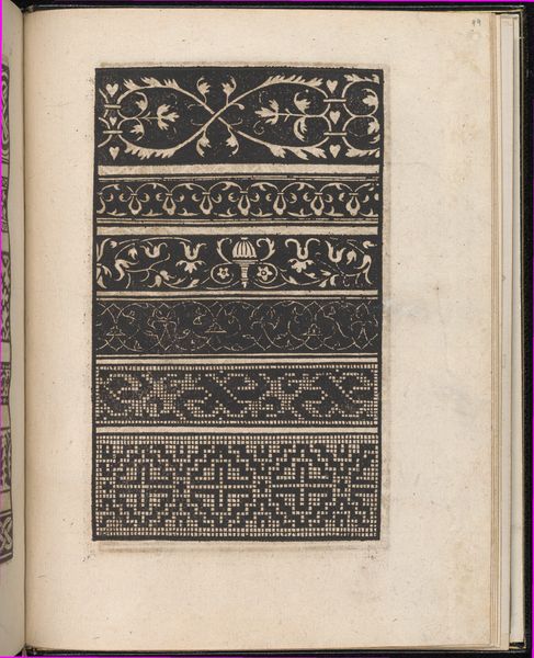
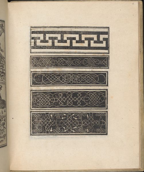
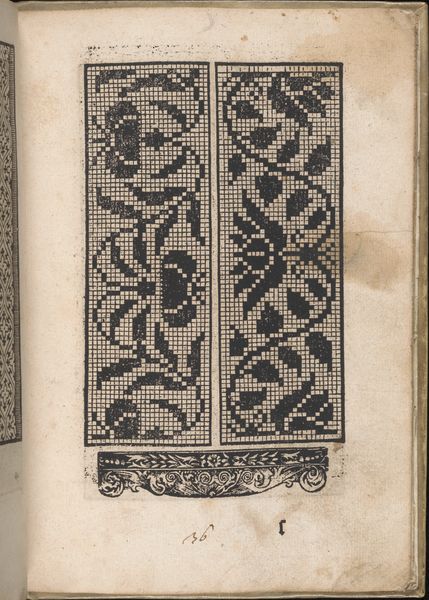
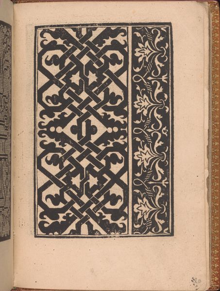
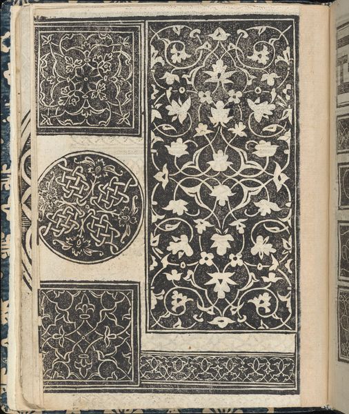
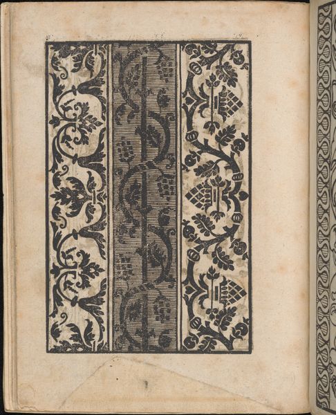
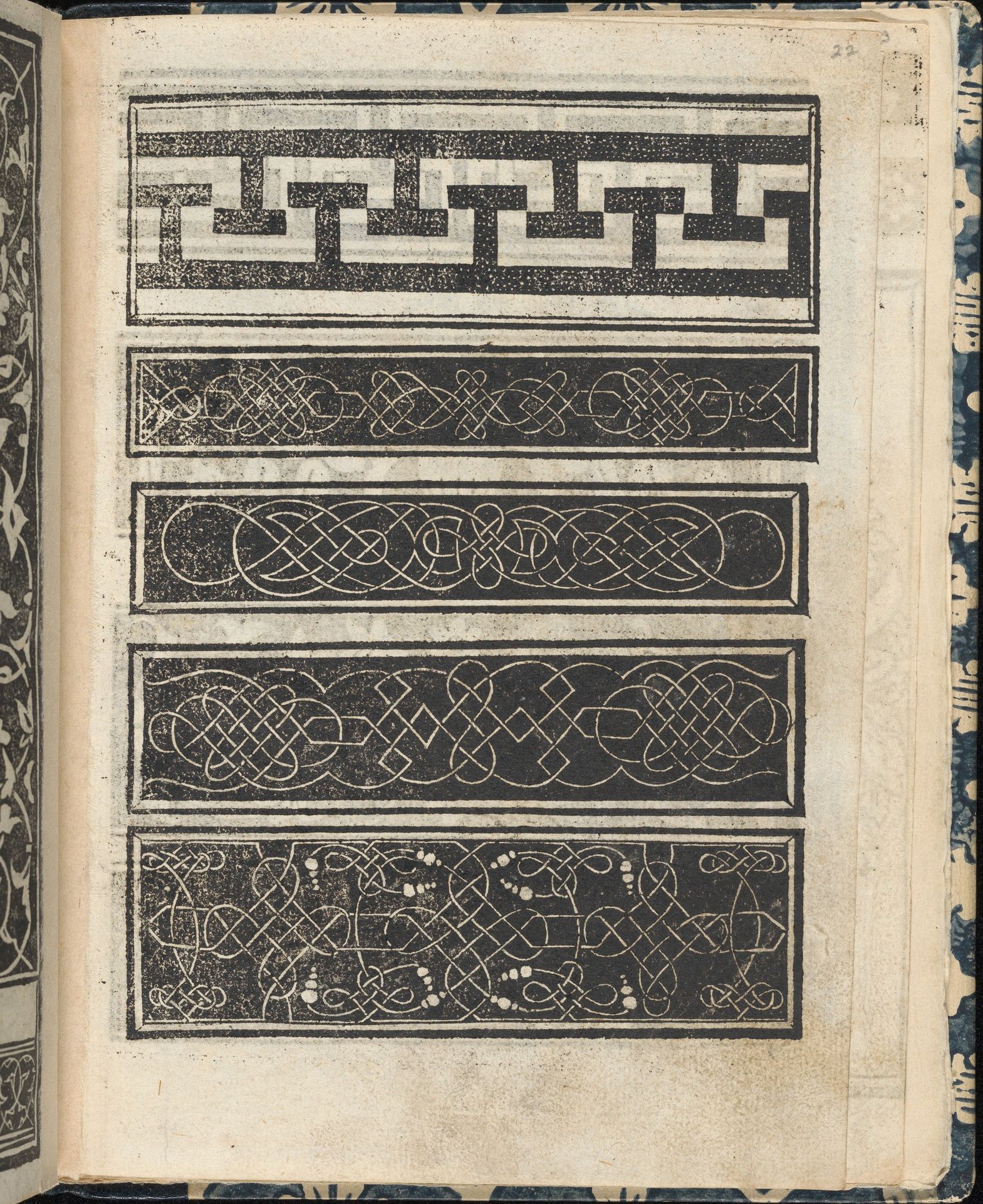
Editor: Here we have "Essempio di recammi, page 22 (recto)," created around 1530 by Giovanni Antonio Tagliente. It's a print, a woodcut, on paper. I’m really drawn to the contrast of the graphic, almost harsh black lines against the texture of the paper. It’s incredibly intricate. What stands out to you about its visual elements? Curator: The intrinsic organization of line within each rectangular border certainly compels a formal reading. Note how Tagliente employs a variety of repeating motifs – meanders, interlace, and geometric abstractions – to create a sophisticated interplay between positive and negative space. Consider, too, how the horizontal arrangement across the page creates a rhythmic structure. What semiotic reading might emerge through decoding the geometric forms? Editor: Semiotic, as in, what these shapes symbolize? Well, some look like knots... maybe symbols of unity? But if we’re just focusing on the forms themselves, is it really about what they *mean*? Curator: Meaning, within a formalist approach, arises directly from the *experience* of form. Consider the texture – its density, regularity, or even its irregularity, and its effect on the viewer. Observe the impact of this contrasting element. Editor: Ah, I see! So, the meaning isn't necessarily symbolic. It's about the feeling created by the composition, by the line, the paper… like the texture adds depth, even though it's a flat image. The artist, by carefully organizing each visual element on the page, creates that specific *feeling*. Curator: Precisely. Now, how might you apply that insight to another Renaissance print? Editor: I'll be paying more attention to the *intrinsic* elements, not just the historical background. Thanks for clarifying!
Essempio di recammi, page 22 (recto)
1530
Giovanni Antonio Tagliente
1465 - 1528The Metropolitan Museum of Art
Metropolitan Museum of Art, New York, NYArtwork details
- Medium
- drawing, print, paper, woodcut
- Dimensions
- Overall: 7 13/16 x 6 3/16 x 3/8 in. (19.8 x 15.7 x 1 cm)
- Location
- Metropolitan Museum of Art, New York, NY
- Copyright
- Public Domain
Tags
Comments
Share your thoughts
About this artwork
Editor: Here we have "Essempio di recammi, page 22 (recto)," created around 1530 by Giovanni Antonio Tagliente. It's a print, a woodcut, on paper. I’m really drawn to the contrast of the graphic, almost harsh black lines against the texture of the paper. It’s incredibly intricate. What stands out to you about its visual elements? Curator: The intrinsic organization of line within each rectangular border certainly compels a formal reading. Note how Tagliente employs a variety of repeating motifs – meanders, interlace, and geometric abstractions – to create a sophisticated interplay between positive and negative space. Consider, too, how the horizontal arrangement across the page creates a rhythmic structure. What semiotic reading might emerge through decoding the geometric forms? Editor: Semiotic, as in, what these shapes symbolize? Well, some look like knots... maybe symbols of unity? But if we’re just focusing on the forms themselves, is it really about what they *mean*? Curator: Meaning, within a formalist approach, arises directly from the *experience* of form. Consider the texture – its density, regularity, or even its irregularity, and its effect on the viewer. Observe the impact of this contrasting element. Editor: Ah, I see! So, the meaning isn't necessarily symbolic. It's about the feeling created by the composition, by the line, the paper… like the texture adds depth, even though it's a flat image. The artist, by carefully organizing each visual element on the page, creates that specific *feeling*. Curator: Precisely. Now, how might you apply that insight to another Renaissance print? Editor: I'll be paying more attention to the *intrinsic* elements, not just the historical background. Thanks for clarifying!
Comments
Share your thoughts