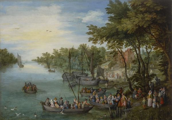
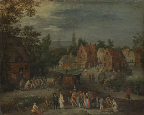
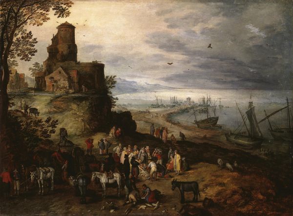
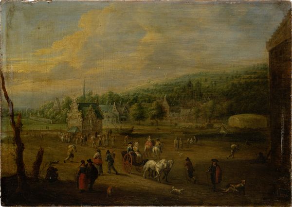
Village Kermis in Schelle with Self Portrait 1613
0:00
0:00
oil-paint
#
baroque
#
oil-paint
#
landscape
#
oil painting
#
genre-painting
Copyright: Public domain
Editor: Here we have Jan Brueghel the Elder’s "Village Kermis in Schelle with Self Portrait," an oil painting from 1613. I’m immediately struck by how detailed the composition is. The artist has packed so much activity into this one scene, but maintains clarity throughout the whole of the work. How do you interpret the relationship between all these different sections? Curator: Let's first appreciate how Brueghel utilizes the high horizon line and aerial perspective to compress a tremendous amount of information within a single pictorial plane. It yields a reading where discrete segments coexist, creating a dialogue among form, color, and space. Do you notice the mirroring in the water of the tall church and buildings on the shore opposite? What does this visual strategy suggest about the relationships depicted within the painting? Editor: I see the way that buildings are mirrored. The reflection adds to the intricacy and visual play in the painting. Perhaps this technique mirrors how the various elements reflect and complement each other, showing the connectivity of community? Curator: Precisely. Note further how the textures change throughout. Close observation suggests a careful deliberation and conscious shift from a macro level of detail to micro brushstrokes to depict space as it extends from foreground to background. How is color employed here to serve that effect? Editor: The colours definitely get more muted with distance! He’s using brighter colours in the foreground where all the action is, drawing my eye. Curator: Indeed. That layering is intentional. We can then explore what it communicates about the structuring elements of baroque paintings. Thank you. I notice new relationships every time I truly *see* the painting. Editor: I completely agree. I thought it was a nice snapshot of a village fair, but it’s a meticulously designed interplay of form and color.
Comments
No comments
Be the first to comment and join the conversation on the ultimate creative platform.
More like this