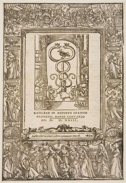
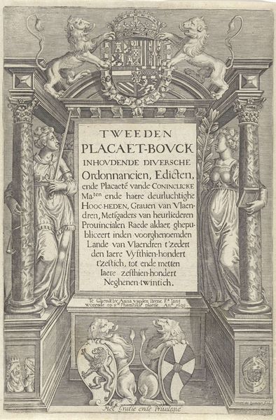
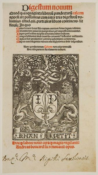
Title-Border and Printer's Mark of Jean Petit (reverse: Initial Q from Cicero, Opera Epistolica) c. 16th century
0:00
0:00
Copyright: CC0 1.0
Curator: This book's title page, designed for Jean Petit, is a fascinating window into the Renaissance. Editor: It’s such an elaborate design, almost like a building facade. What catches your eye the most? Curator: The heraldic symbolism, definitely. The lions, the fleur-de-lis... It speaks volumes about Petit's aspirations and perhaps even his social climbing. Do you think it's effective? Editor: The lions do seem a bit much, maybe a little try-hard. But I guess it was the style back then. I wonder if Petit himself chose that design? Curator: Precisely! It makes you wonder about the collaboration – or lack thereof – between patron and artist. That’s the beauty of these objects; they are both art and historical document. Editor: I never thought about it that way! Thanks.
Comments
No comments
Be the first to comment and join the conversation on the ultimate creative platform.
More like this