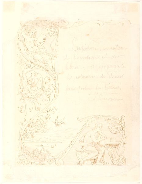
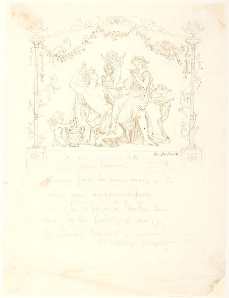
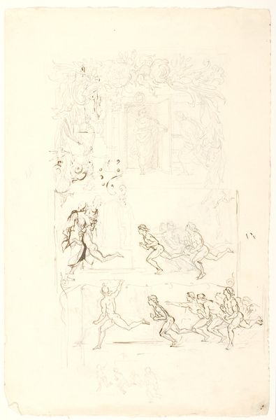
Om du vælter dig paa dit ensomme Leje, om du kaster dig fra højre til venstre... intet vil det baade dig... 1860
0:00
0:00
Dimensions: 270 mm (height) x 207 mm (width) (bladmaal)
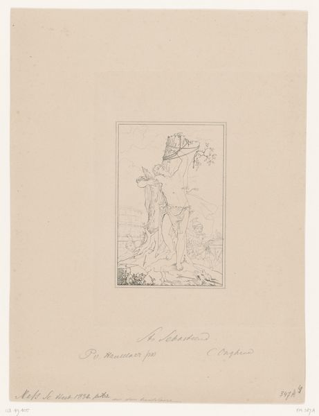
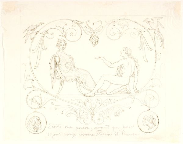
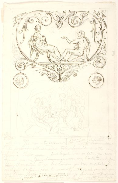
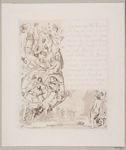
Editor: We’re looking at a pencil and ink drawing on paper by Lorenz Frølich, created in 1860. The title is quite a mouthful: "Om du vælter dig paa dit ensomme Leje, om du kaster dig fra højre til venstre... intet vil det baade dig..." or in English, “If you toss about on your lonely couch, if you throw yourself from right to left... nothing will avail you…". I'm struck by how light and airy it is, almost like a dream. How do you approach a piece like this? Curator: Initially, the composition draws the eye. Note the arrangement of figures – how they are distributed across the plane, seemingly floating, organized by linear, organic elements. The interplay between the figures in repose and the architectural scene below establishes a clear division within the pictorial space, though rendered in the same delicate tonalities of pencil and ink. Consider also the texture achieved through line weight and density. What does the artist achieve with this variation? Editor: Well, the varied line weight does give depth, particularly to the figures in the upper section, suggesting a weightlessness in contrast to the defined structure and the architecture beneath. Curator: Precisely. The stylistic choices align with Romanticism. Examine how the figures' gestures and postures interact. Each conveys a sense of introspection or longing. Even the decorative, almost Rococo, elements have a structuring effect. Are they merely ornamental, or do they further inflect the composition? Editor: I see your point. Even those flourishes help guide the eye and reinforce the separation of spaces, almost like framing each figure's emotional state. Curator: Precisely. And this close analysis helps uncover how Frølich achieves the delicate balance between form and content to generate such depth in such a sparse piece. Editor: I see it now, focusing on these core elements clarifies its effect. Curator: Indeed, it’s the structure that communicates so profoundly.
Comments
No comments
Be the first to comment and join the conversation on the ultimate creative platform.
More like this